Impressions from the Big Apple
My wife and daughters just returned from a week-long trip to New York City. For my wife and youngest daughter it was their third visit during the six years we now have been living in the US.
We love living in a rural area in South Carolina, and although our family is divided on the question of whether we could live in a place like New York its diversity of architecture, cultural mix, and entertainment opportunities pulls all of us like a magnet.
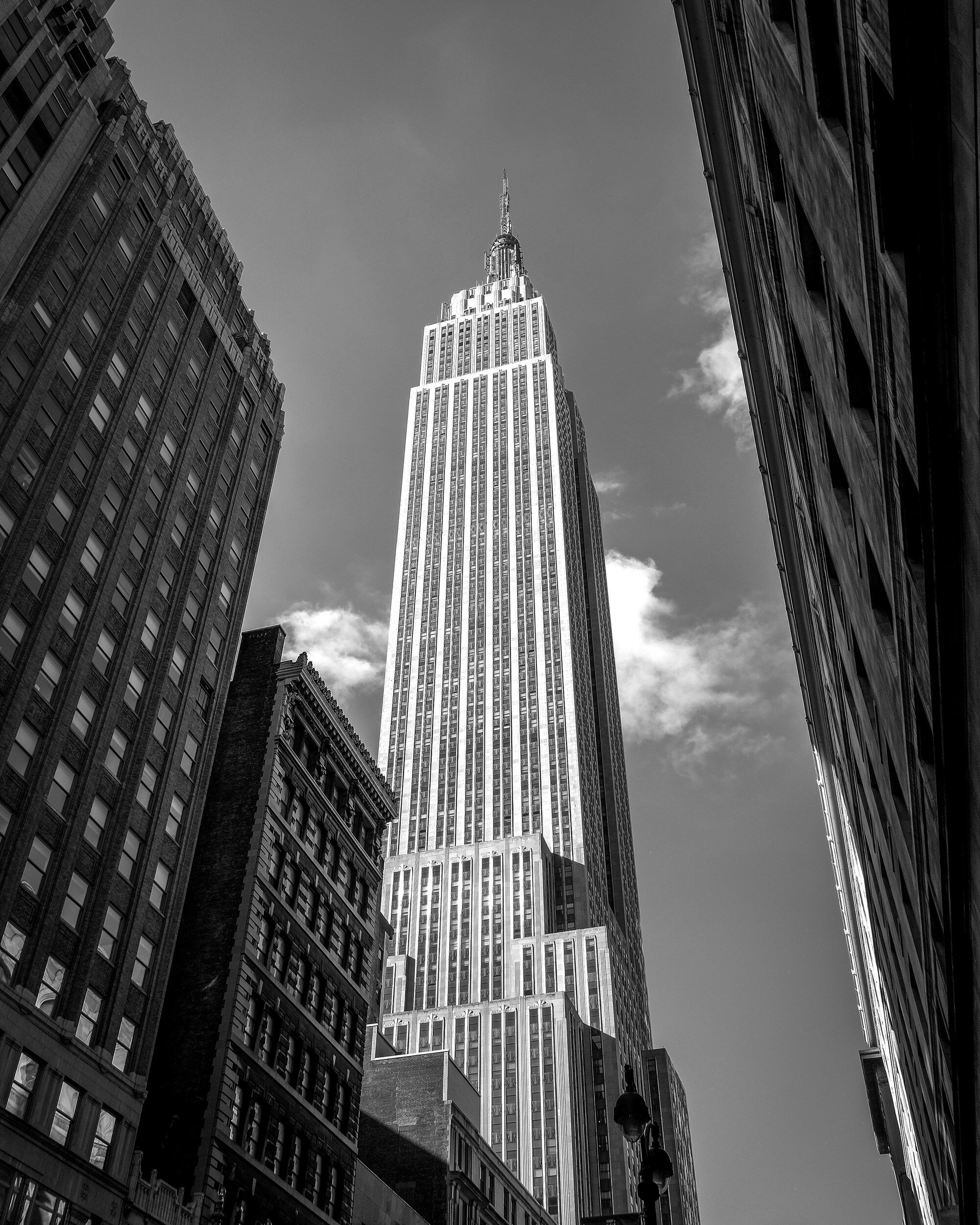
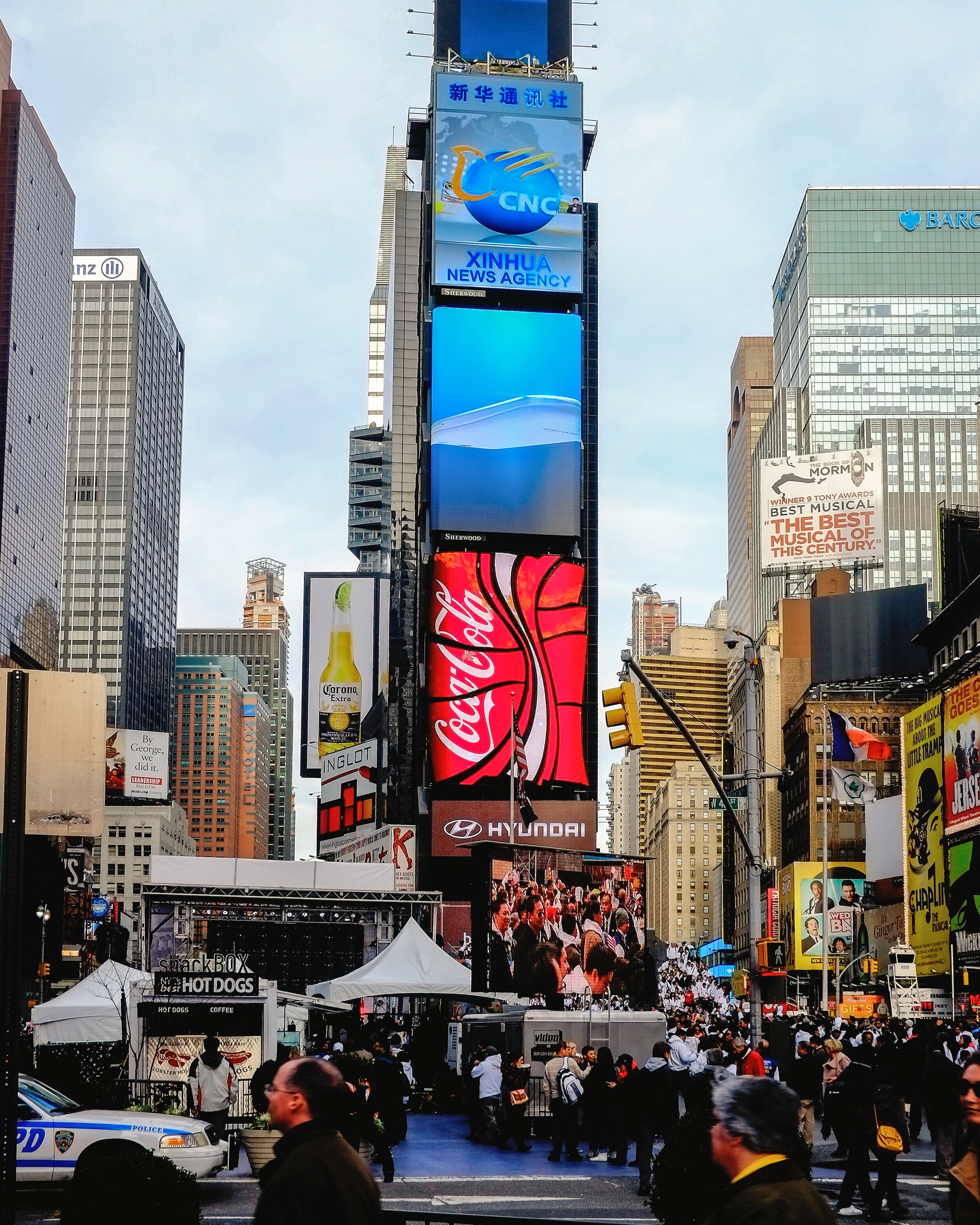
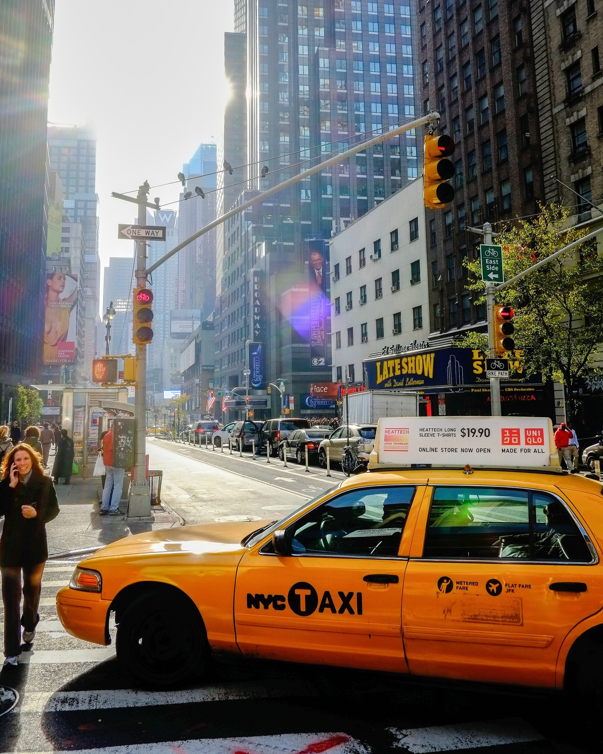
Not only because of the great landmarks: the Statue of Liberty, Empire State Building, Ground Zero, Saint Patrick's Cathedral, and so much more. Also, and far more entertaining, because of the people. Locals and tourists provide an ever-changing palette of colors and behaviors against the Big Apple's backdrop of high rises, neon signs, yellow cabs and the never-ceasing sounds of a big city.
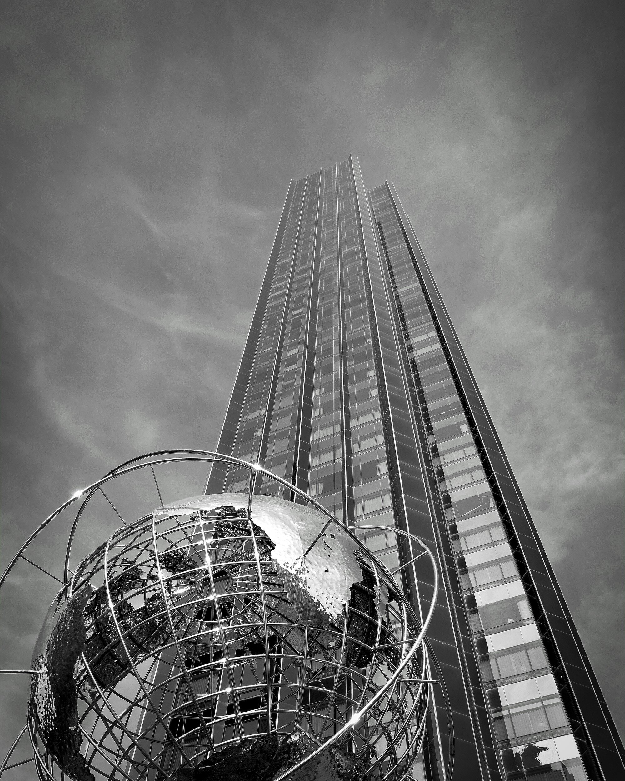
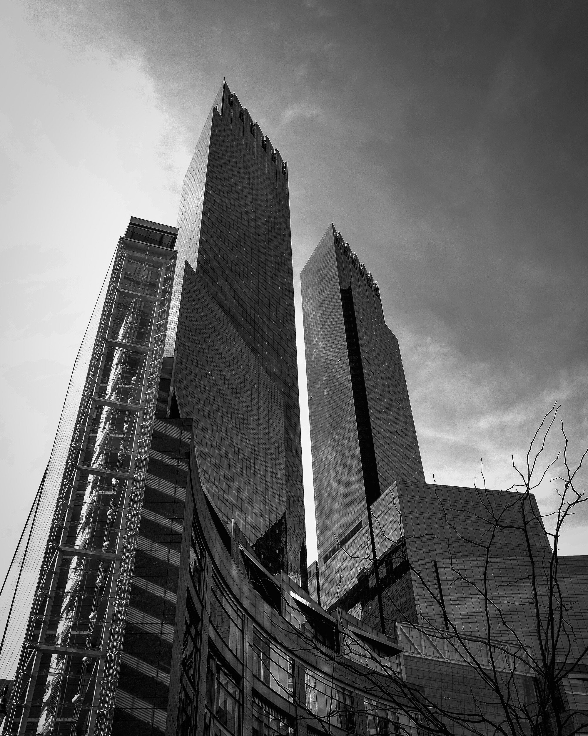
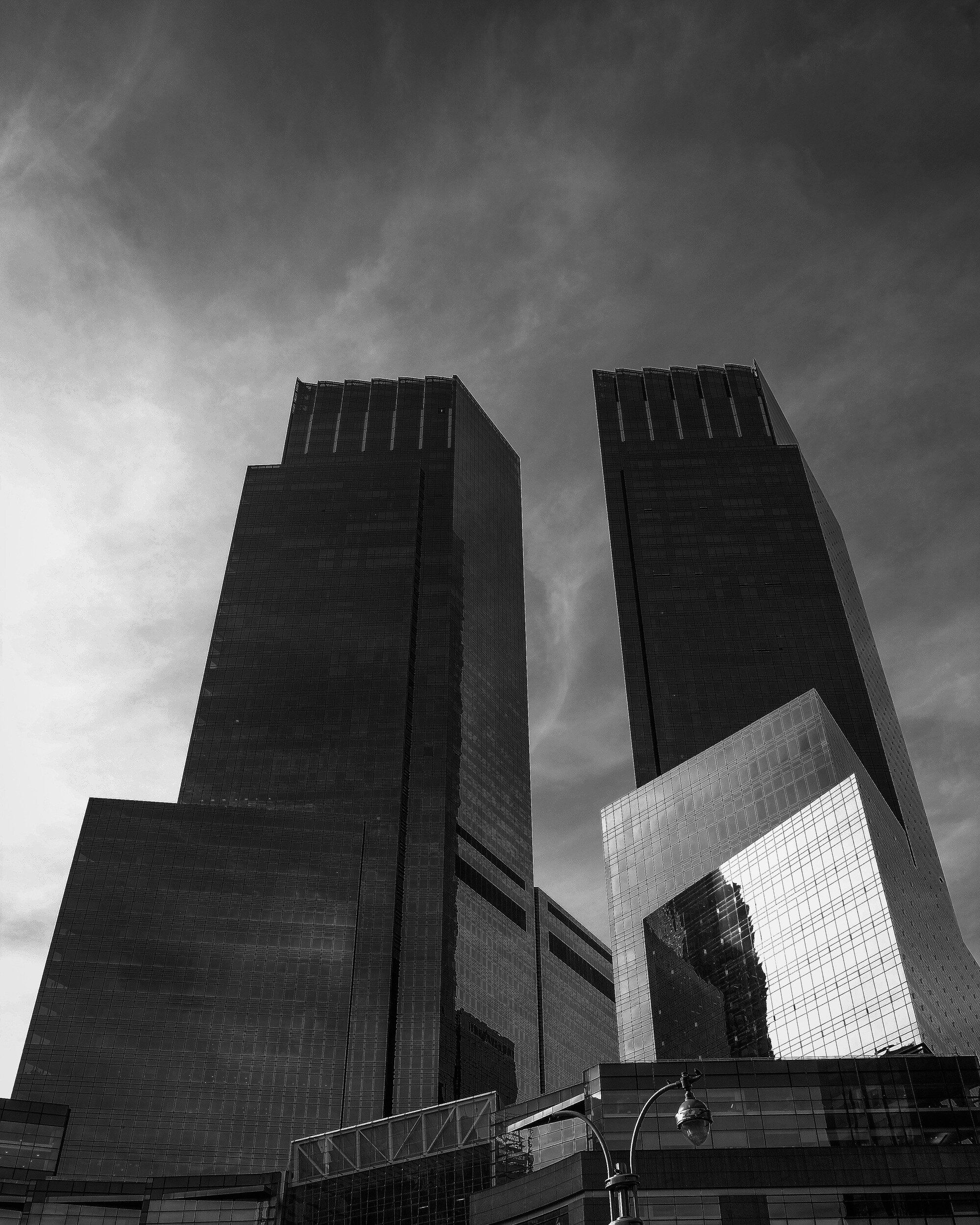
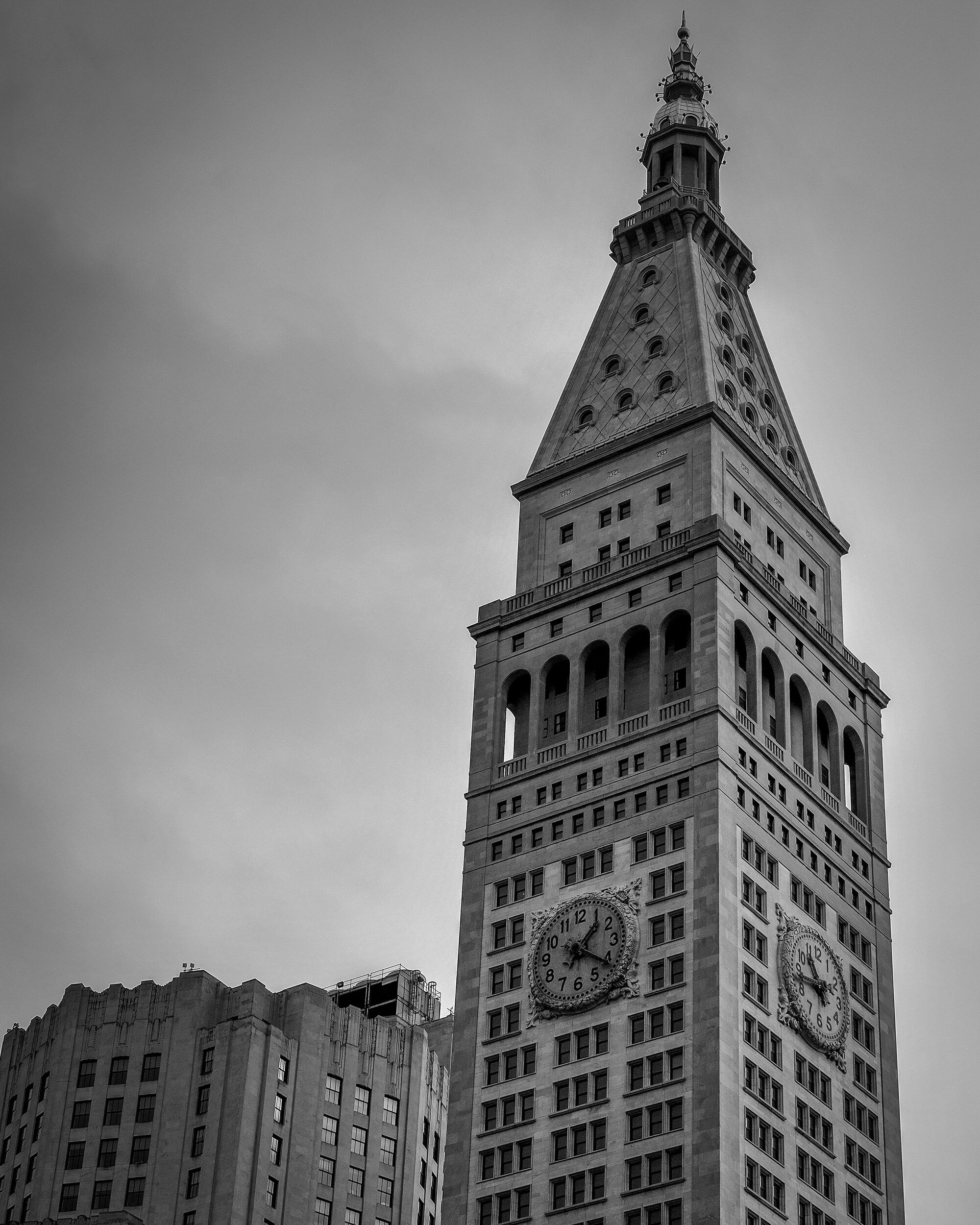
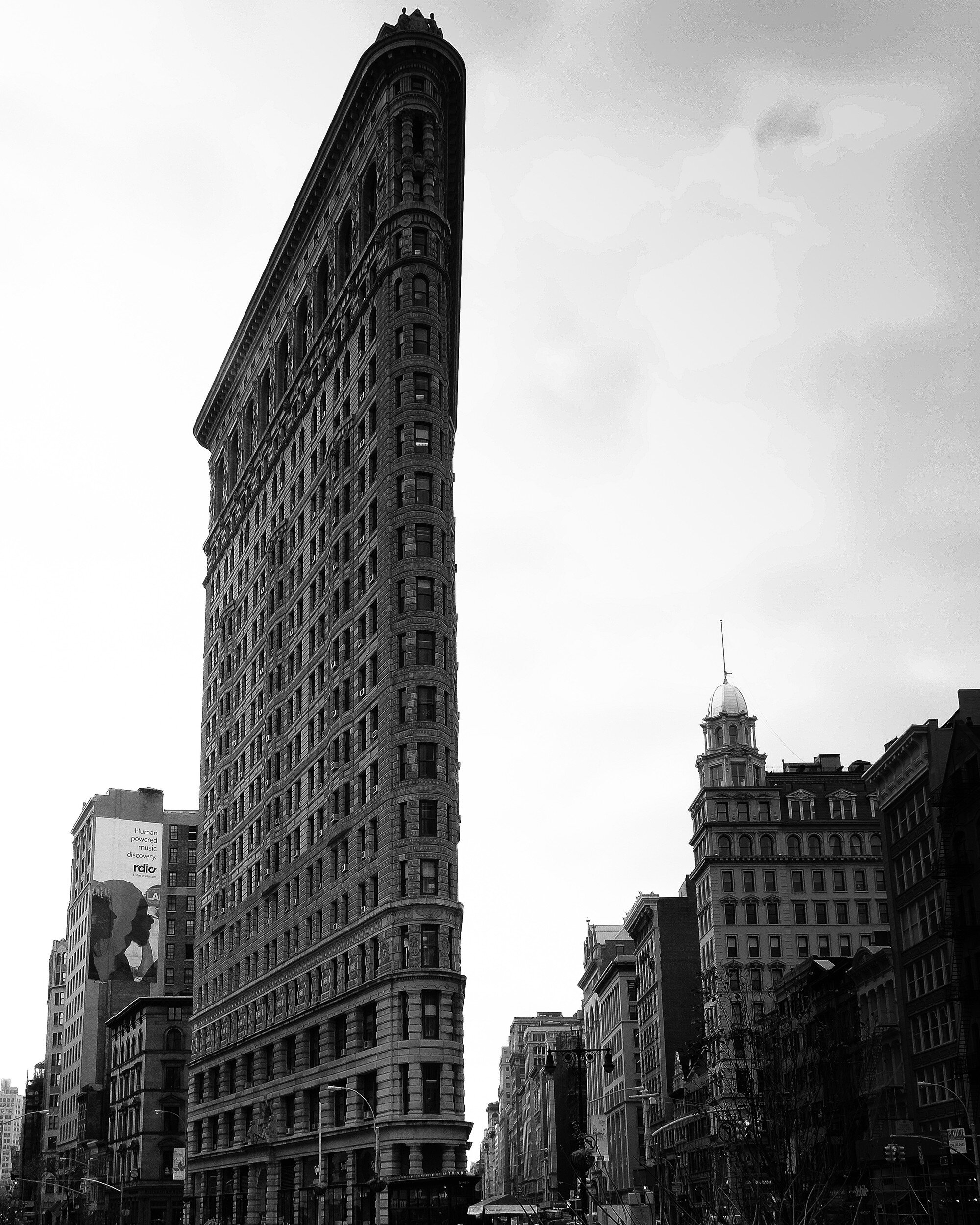
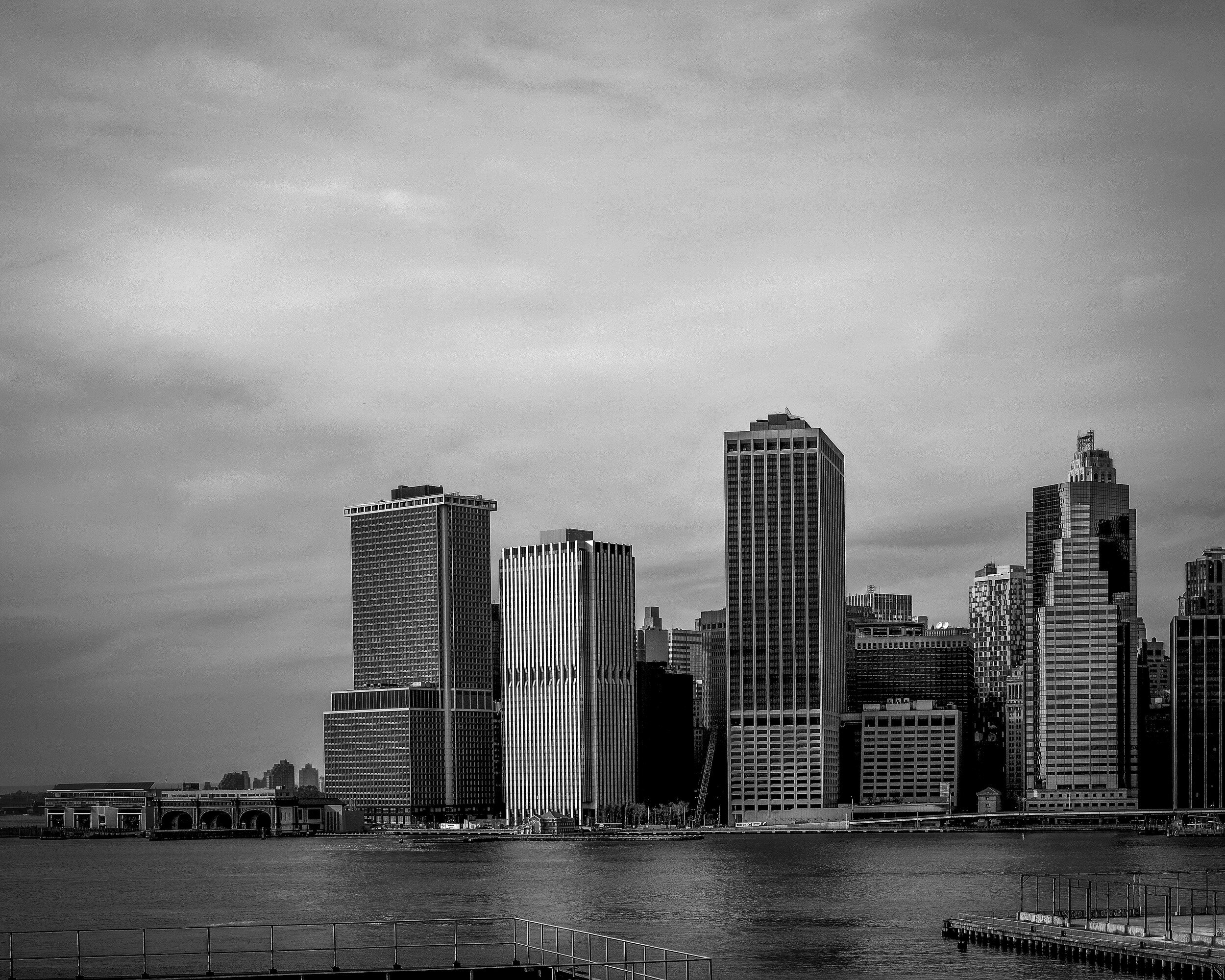
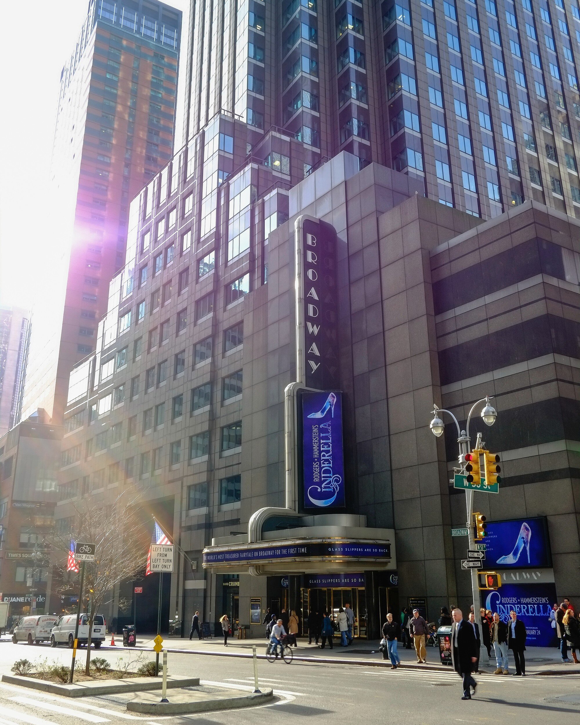
I, unfortunately, have been to this bustling melting pot only once, and I definitely want to go back. The images below are some impressions from that visit, published in a magazine-size photo book.
All pictures taken with a Fujifilm X-Pro 1 and the Fujinon 18mm and 35mm lenses.
Black and White Impressions
Street, architectural, and city-scape images usually appeal to me most when created in black and white. Not having any color accents distracting from the main image subjects helps me focusing on forms, lines, and the situation at hand.
Color Impressions
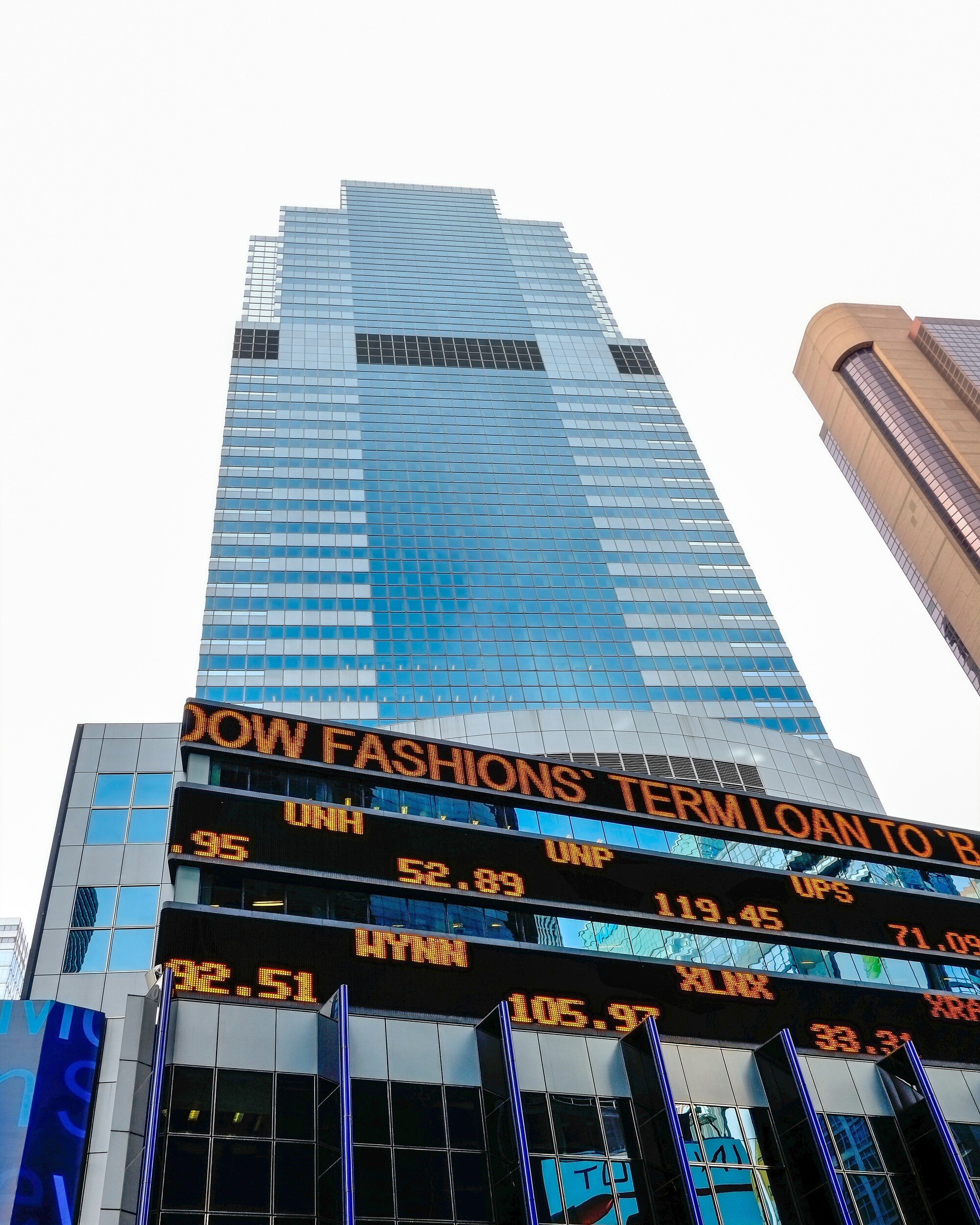
Sometimes, however, color is a must have! This might seem contradictory to what I just stated above, but whereas in general black and white is my preferred setting for street and cityscape photography color can help focusing on accents, juxtapositions, providing additional layers of texture, or just capturing the vibrancy of a city like New York.
Compare the picture below with the first black and white picture above. Actually the same image rendered in black and white, and in color. I would be hard-pressed if asked which one I actually like more; both have their own appeal. Which one do you like most?


