Image Of The Month: Grass With Water Drops
'Grass With Water Drops' Behind The Scenes
Taking the Picture
The image I am going to discuss today was taken July 2010, and final changes for publication were made in 2017.
In 2010 my family and I lived in South-Africa, and my wife's sister with her husband and two kids visited us from the Netherlands for their summer vacation. Although our initial plan was to rent an eight-person Landrover (but that is a story for another time), we rented the ubiquitous Toyota Hiace van and made a round trip from the Johannesburg area where we lived to Durban, stopping at a couple of safari parks and staying at camp sites and lodges.
One of our overnight stops was at Didima resort, located in the Cathedral Peak valley of the u Khahlamba Drakensberg park, approximately halfway between Johannesburg and Durban. The resort has several cottages with great facilities, and we rented two cottages for my and our sister in law's families. The area surrounding the resort is great for hiking, and it was during one of our hikes when I noticed some nice high grass with early morning dew drops clinging to it.
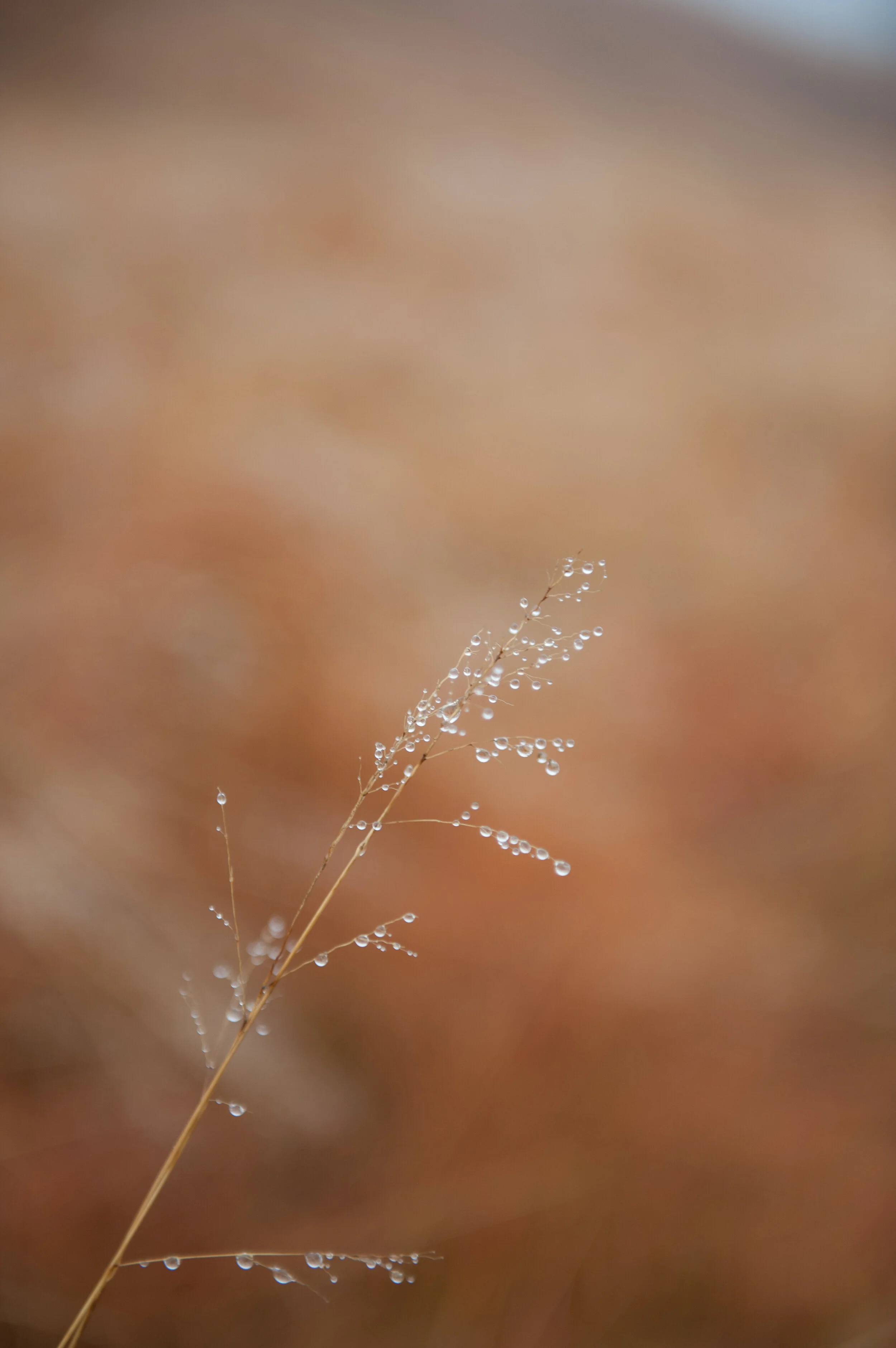
At that time I still had my Nikon D700 camera (read a previous post to learn why I sold this gem), and I used the 24.0-70.0 mm/f2.8 lens to capture it. The D700 is a full frame sensor camera, and for this image I shot it at 70mm focal length. Since I wanted the grass and water drops stand out against the background, I created a very shallow depth of field by selecting the f2.8 ("wide open") aperture. This led to a shutter speed of 1/320 second.
Creating the Image
Since I only started this website in 2013 with real activity only starting in 2017, this image like too many others had been living on my computer's hard drive without seeing any action.
The Nikon D700 has a sensor that produces images with an 2:3 aspect ratio, my preference however is for images with 4:5 and 1:1 aspect ratios. I therefore had to crop the original image to create versions with these aspect ratios for publication and printing. In addition, I wanted a 1:2 aspect ratio version because that was the format more easily accepted by Twitter.
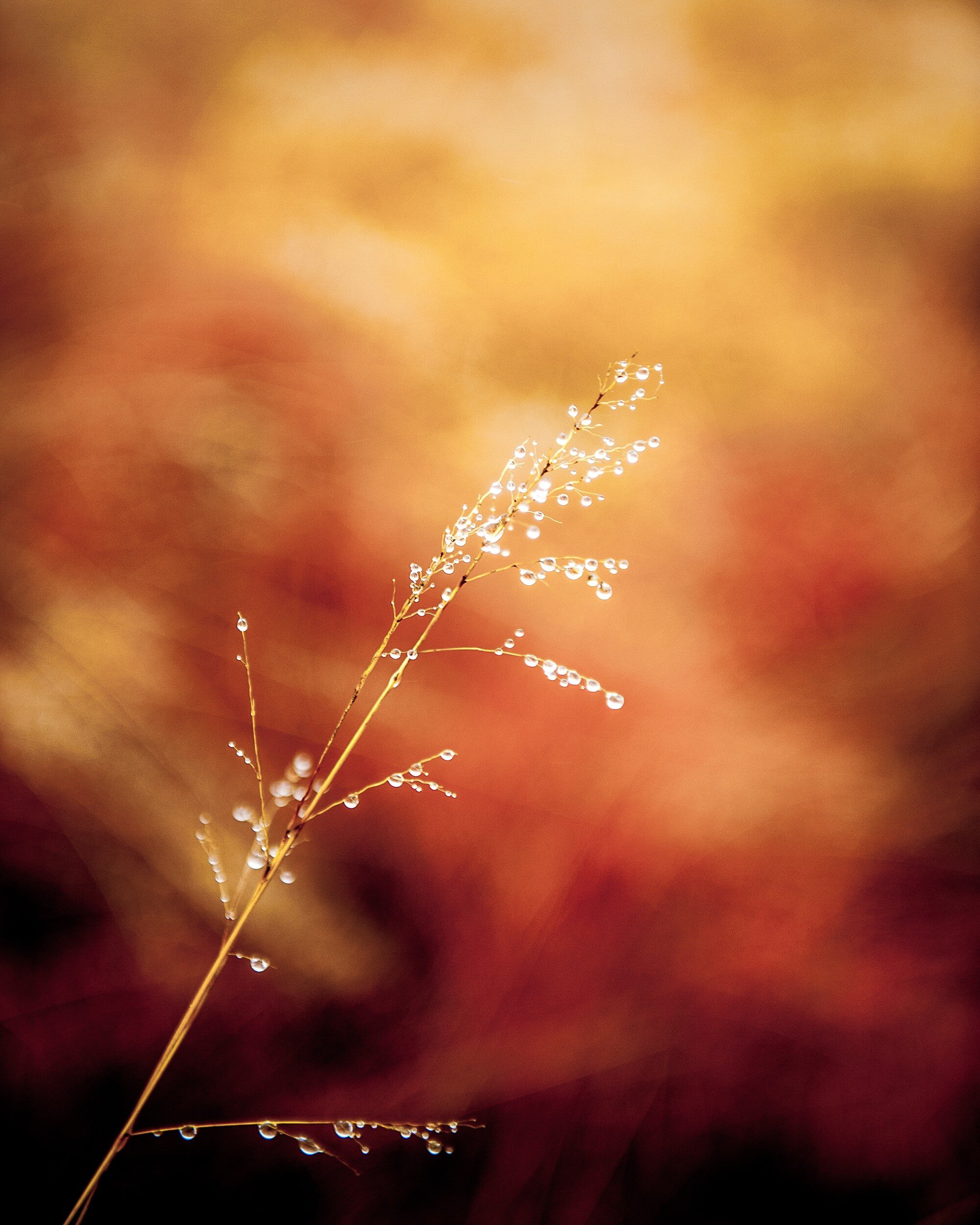
Furthermore, although the original image as created in-camera was not unsatisfactory (see below), I wanted a more dramatic and abstract view. In other words: there was work to do.
The image as created in-camera / 2:3 aspect ratio
Adobe's Lightroom provides me with all the tools I need for what I want to do and accomplish with my images, and I try to use as less of its tools as possible to achieve the final results I have in mind applying all tools from top to bottom as they appear in the Develop menu: Basic, Tone Curve, HSL/Color/B & W, Split Toning, Detail, Lens Corrections, Transform Effects, and Camera Calibration.
Color Versions
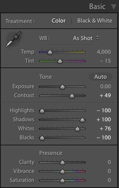
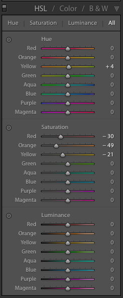
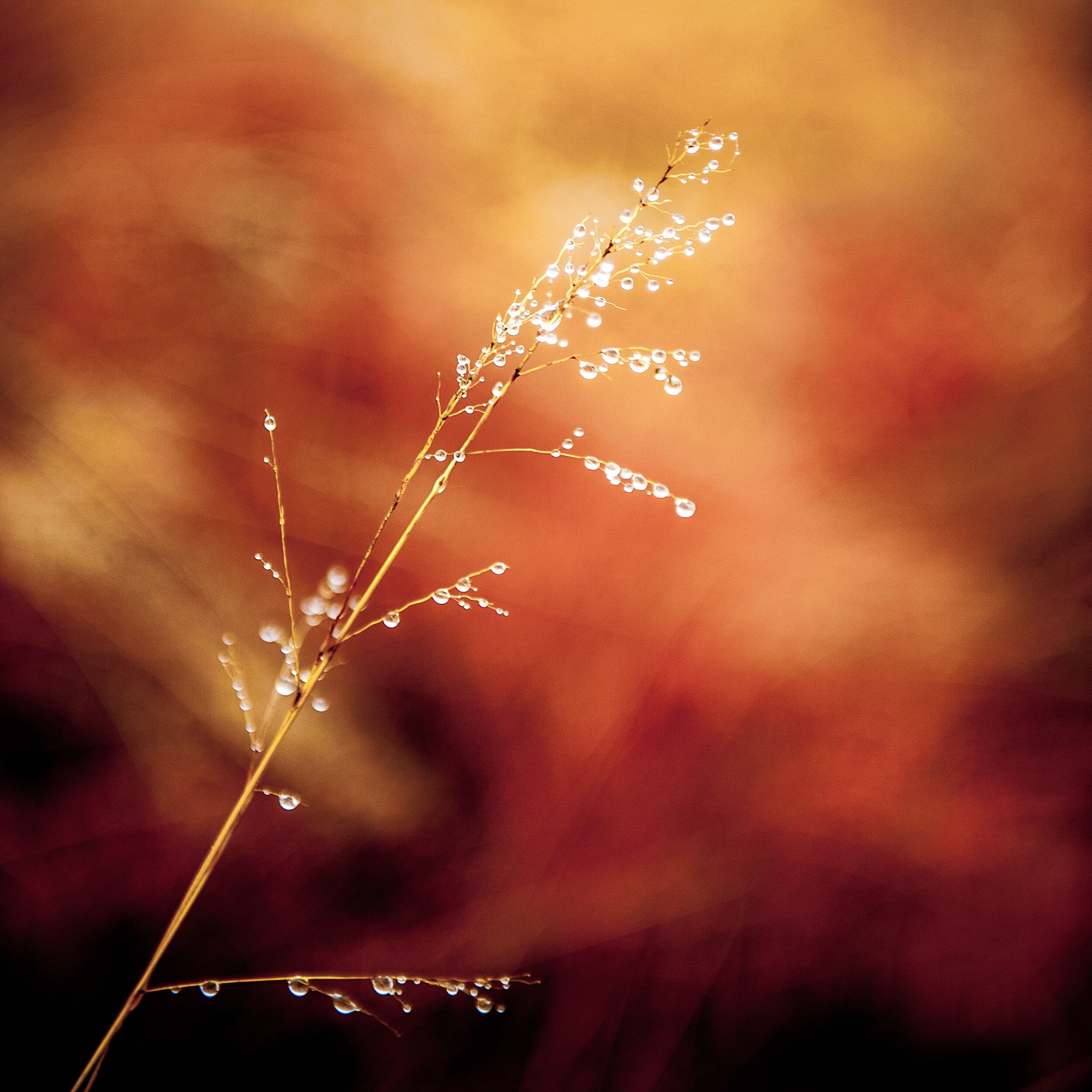
For the color version I adjusted the Basic, HSL, and Detail sliders as shown below.
Although the saturation changes for the Red, Orange, and Yellow colors are very important to create the effect I desired in the color versions, the most important changes I made were in the Basic section by reducing the Highlights and Blacks to the maximum, increasing Shadows to the maximum, and increasing the Whites to 76% of maximum.
This means that any Highlights in the image have been reduced to almost zero, and the Black areas in the image have been made as black as possible. The shadows have been made as light as possible and any white areas have been made almost extremely white. I also added some sharpening and noise reduction.
Since I wanted to have an additional color copy in 1:2 aspect ratio to use on Twitter, I had to crop again. This horizontal 1:2 crop was quite a challenge since the main object in the image has a vertical structure. In the end I decided to keep the top of the grass in the image, creating the result below.
Black and White Versions
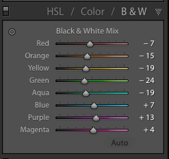
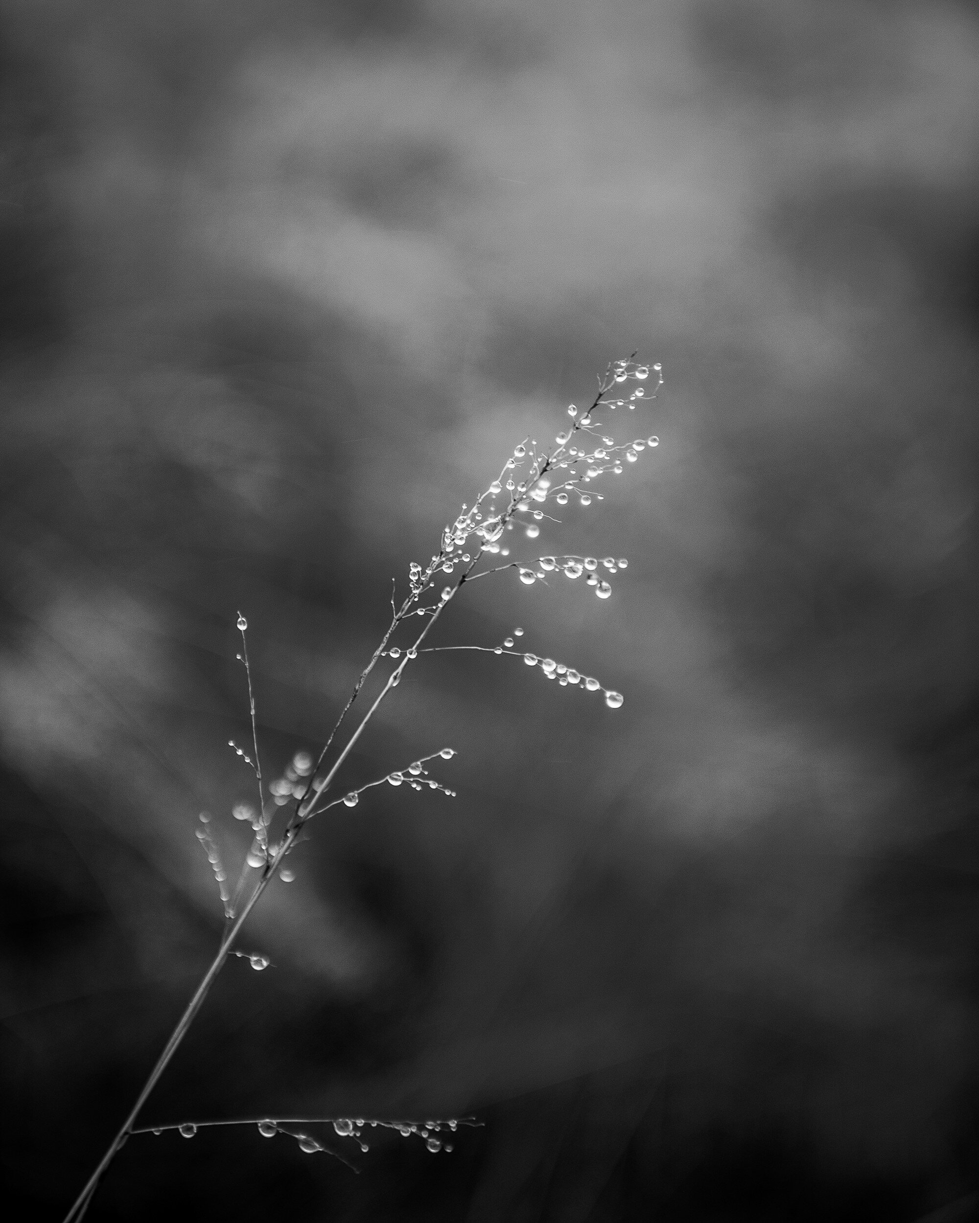
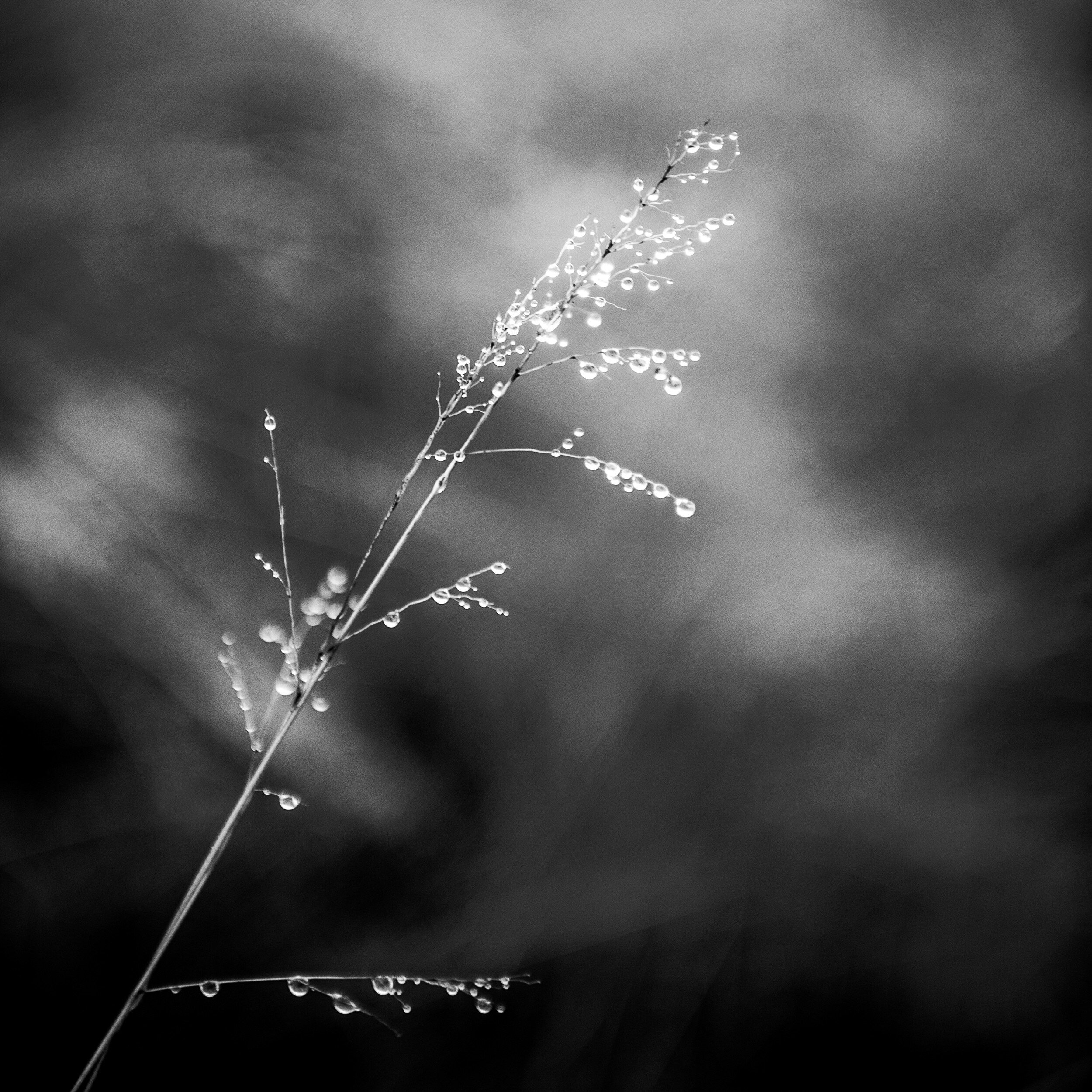
For the black and white copies I kept most Lightroom settings the same as for the color ones. However, to accomplish the best effect in black and white, I needed to play around a bit more with the color settings in the HSL/Color/B&W panel.
Resulting in the following result (after cropping to 4:5 and 1:1 aspect ratios respectively.
Final Thoughts
I am quite pleased with the final results.
In both the color and black and white versions the shallow depth of field separates the main subject very well from the background. This effect has been enhanced by the adjustments I made in Lightroom, with quite a dramatic effect in the color versions.
The original composition works very well after cropping to the 4:5 and the 1:1 aspect ratios. In the 4:5 version, the direction of the grass follows almost exactly the diagonal of the image rectangle. Although the 1:2 version was predominantly created to comply with Twitter image requirements, it actually produced a very balanced composition with more focus on the detail at the top of the grass.
- - - - - - -
I hope you enjoyed this background story about the creation of the Grass With Water Drops images. Don't forget to subscribe to ensure you will receive new information like this, and Haiku, PicTales, and other stories delivered to your email inbox the moment they are published.

