

What Type Of Photographic Print Did You Buy?
A brief introduction to photographic prints
You decided you want to collect fine art photography and you have bought, framed, and displayed your…
A brief introduction to photographic prints
You decided you want to collect fine art photography and you have bought, framed, and displayed your first print.
You are admiring your purchase, and probably showing it off to your friends. But do you actually know what type of print it is (your friends might ask...)? Ideally, you should have known before you bought the print. Or at least you should have seen it on the certificate of authenticity.
Assuming you want to buy more photographic prints in the future, and to offer a helping hand for making educated decisions, I have listed after the break a brief overview of the most common photography print types you might encounter when searching for your collection.

Contemporary print types
The first group of photographic printing techniques is what I like to call 'contemporary'. Although some of these techniques have been in use since the early 20th century, all are still currently being used by a broad range of photographers. The more modern printing techniques in this section are very commonly used by fine art photographers and are most likely the ones you might encounter at art fairs and even in high-quality galleries.
Gelatin silver print (silver halide print)
This is what most people have in mind when talking about black and white photography. These prints are made in a 'wet process', using chemicals in a darkroom. The printer uses an enlarger to project the image from a negative film onto photographic paper that has been made sensitive to light by adding a gelatin silver layer. Changes to the final print can be made by exposing the photographic paper for a shorter or longer time, sometimes using dodging and/or burning tools to impact certain areas of the image.
After exposing the photographic paper, it is put through several chemical baths to develop and fix the image.
When correctly done, this process delivers beautiful black and white images of a very high archival quality and longevity.
C-Print (Chromogenic print)
This is basically the same technique as for the gelatine silver print but printed from a color negative or slide. It is the most common type of color photographic prints made in the darkroom.
The big difference is the photographic paper used. C-Print paper has different layers, with each layer on the paper sensitized to one of the primary light colors (red, green, and blue). Since color is rendered different on paper than with light, the light-sensitive layers on this paper are composed of cyan, magenta, and yellow.
Whereas the enlarger, photographic paper, and chemicals are different than for gelatin silver prints, the whole darkroom process basically is similar. And this process also creates (color) images of very high archival quality and longevity.
Digital C-Print
Where gelatin silver printing and C-printing has been available since the early and mid 20th century, the Digital C-Print is from a more recent era.
With C-printing the wet part of the developing process is actually the same as with the former two printing techniques (putting exposed photographic paper through several chemical baths). The difference concerns exposing the paper: where for gelatin silver printing and C-printing a traditional negative is used in an enlarger, for Digital C-Printing a digital 'negative' is projected with laser light on the paper.
This means that it is no longer necessary to have actually a negative film available to make darkroom prints: images can be directly used from photo manipulation programs like Lightroom, Photoshop, PhaseOne, etcetera.
Since the actual developing process is similar to gelatin silver and traditional C-printing, the prints created with Digital C-Printing also have a very high archival quality and longevity.
Giclee or archival inkjet prints
With the development of high-quality inkjet printers and pigment-based inks, the giclee or archival inkjet print probably has become the most common printing technique for fine art photography today.
It is important to distinguish the giclee print from regular inkjet prints: it is imperative that pigment-based inks are used to achieve the archival quality and longevity that true giclee prints have. When purchasing a limited edition print this, of course, should be indicated on the certificate of authenticity.
Polaroid
Like other traditional analog (film-based) photography, Polaroid photography has made quite a come back recently. The Polaroid process creates dye diffusion transfer prints, where the chemicals included in the film package create an 'instant' image on the light sensitive paper that also is held within the camera.
This printing process generally creates unique, 'one edition' images. However, when the peel-apart version of instant film is used it is possible to retrieve a negative from the sheet with the chemicals (which usually is thrown away). That negative then can be used for other printing techniques as mentioned above.
The archival quality and longevity of instant prints are not as good as prints created with any of the other processes mentioned in this blog.
Vintage print types
The second group of photographic printing techniques contains processes I like to call 'vintage'. Although some of these processes are still in use by fine art photographers, they are more specialized and less commonly used than those above.
Cibachrome (silver dye bleach print)
Although I placed this process in the Vintage group, it is quite new: being developed in the early 1960's.
Prints created using this technique are recognizable from their high-gloss, plastic-like paper base and the very bold colors. The prints are created through a process where dyes that exist in the photographic paper are selectively dyed, providing one of the most stable and long-lasting of all color prints.
Photogravure
With this process a traditional negative is transferred to a copper plate, which then can be used for making multiple prints. Since this is copper plate printing, there is no use of light sensitive paper or darkroom chemicals. The images sometimes are recognizable by the imprint the copper plate left on the paper.
Albumen print
This is an old technique where images from a negative are printed on paper that has been made light-sensitive with a coat of egg white sensitized with silver salts. The negatives used often were glass plate negatives.
Albumen prints, which were very common during the 19th century, render a very high level of detail.
Cyanotype
Cyanotypes are created using a contact-printing process. Paper is made light-sensitive by brushing iron salts on it. An object, or a negative, is then placed directly on the paper and exposed by light (this can be done with an enlarger or any other light source; even just laying it in the sun will work).
Prints created using this process are easily recognizable by their bright blue tone.
Daguerreotype
This is actually one of the oldest processes for making photographs, and it produces one-of-a-kind type of images. A copper plate is coated with a silver emulsion and then directly exposed in-camera. After further chemical treatment in a darkroom it produces an image directly on the copper plate.
Daguerreotypes are immediately recognizable because of their very shiny surface, almost like a mirror, and the very high level of detail in the image.
These photographs are also extremely fragile and usually are kept within a protective sleeve or presentation frame.
Daguerreotypes were later replaced by Platinum and Palladium prints: whereas the basic technique of creating an image is the same as with the Daguerreotype, they are longer lasting and have a greater tonal range.
I hope the information above provides some helpful starting points for you to make educated decisions regarding building your fine art photography collection.

Am I A Photographer Who Writes, Or A Writer Who Takes Pictures?
Why it is easier for me to create stories to images, than creating images for stories
In my post Why I Combine Photography With Stories, I explained why I use storytelling techniques to…
Why it is easier for me to create stories to images, than creating images for stories

In my post Why I Combine Photography With Stories, I explained why I use storytelling techniques to share my fine art images with the public.
As mentioned in that post: it is my artistic vision, triggered by a quote from Anais Nin, that my role as a photographer is to show and share what we usually do not see.
Reviewing that blog post, however, made me realize that it might not be always clear for my viewers and readers what my main interest and focus is: being a photographer, or being a writer.
I love to observe the world around me and create beautiful images based on the impressions I get.
Most of the time I let these images tell their own stories.
Sometimes, however, I use stories to share what I see in the images I create and to invite the viewer to see the same, to join me on a journey of discovery.
In those cases, it can happen that the moment I push the shutter release button I already know what story I am going to write.
More often, I look at an existing image and see a new or different story emerge.
In some cases, however, I work on projects where I start with the story in mind and then need to create images that support the story. And to be honest: I am often struggling with these projects.
For me, it is easier to see a scene and it’s sometimes hidden message, or to look at an existing photograph and see a new story, than creating images that support a pre-existing story or message.
It is not that I don’t know what I want to tell and share, or that I don’t know what type of images I need to support the written story. The challenge, for me, working this way, is that having the story already in my mind creates restrictions regarding the subject, type, and the number of images to create.
I don’t really know why this is.
Maybe working from a pre-conceived story is too restrictive for my visual mind? Maybe I’m just too lazy to work hard finding scenes and images to an existing story? Maybe I’m too easily bored with an existing story? Maybe in my mind, the story is complete once the words are added to it, and I don’t see a need to then create images to support the story?
Although it is not really clear to me why it is easier for me to create stories to images than creating images for stories, it makes me realize once again why I create images at all: not primarily for the stories, they tell, but just because they are beautiful. And although there is a real danger here to start a ‘chicken or egg’ discussion, I know that for me creating beautiful images is the real reason I make photographs; stories are just the icing on the cake.
Yes, I am a photographer first, and a writer second.

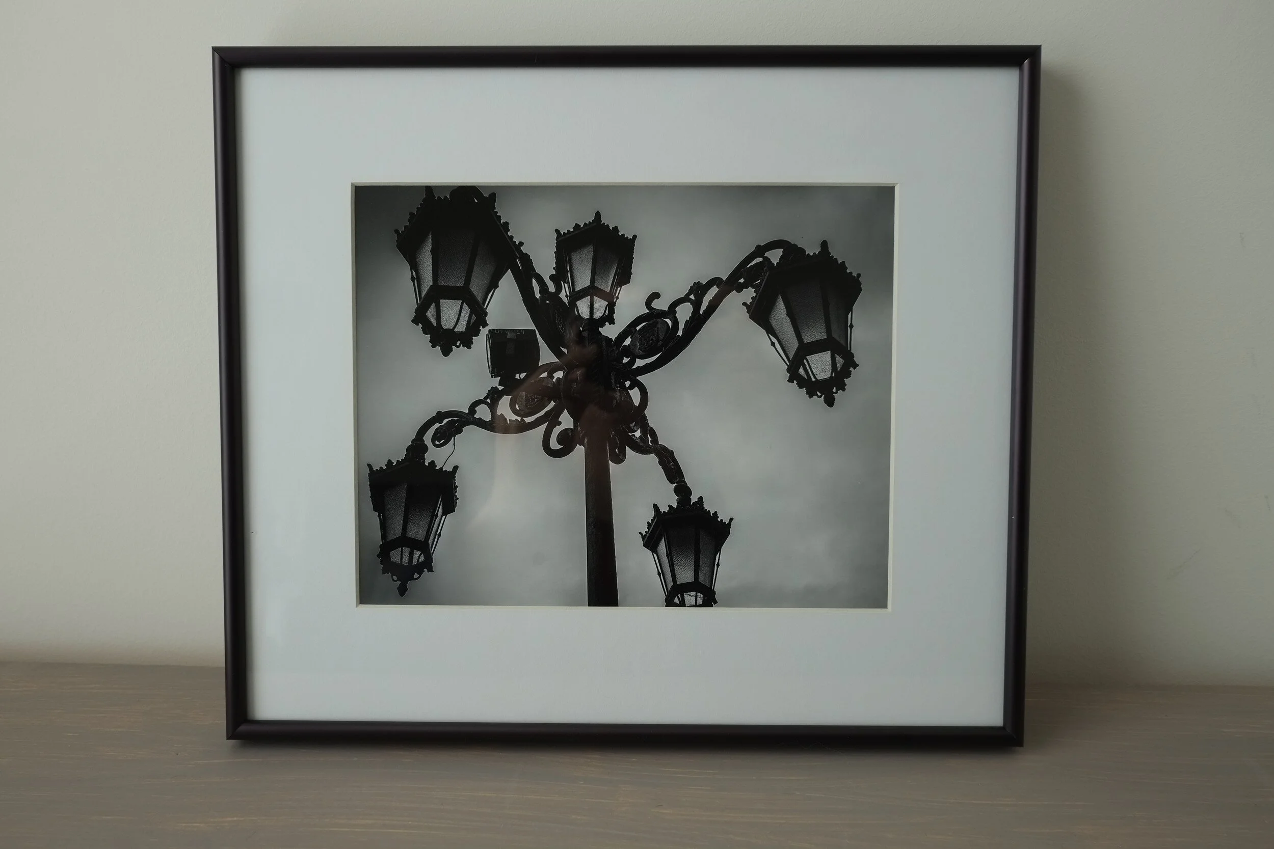
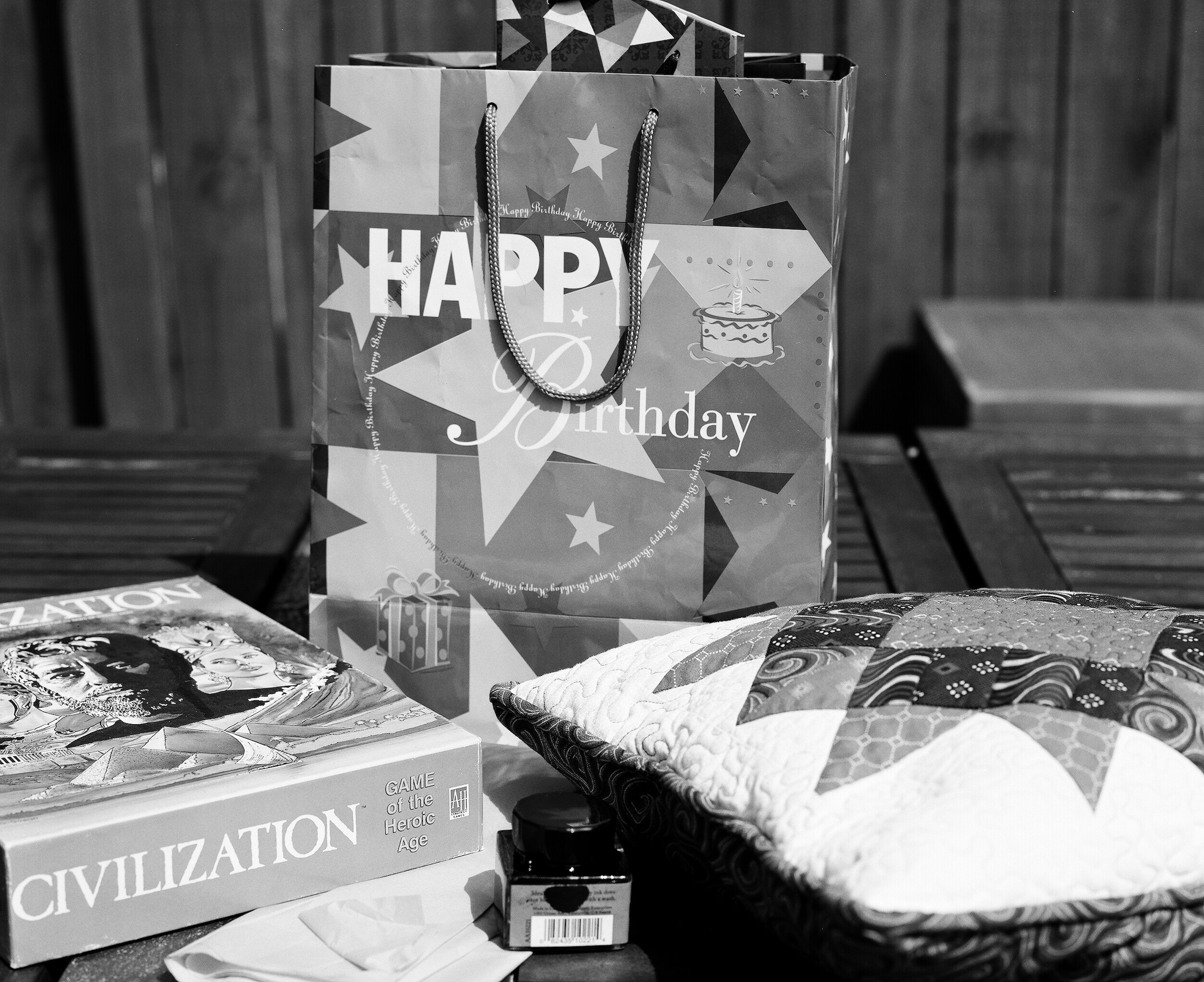
You Bought A Fine Art Photography Print, What Now?
Matting, Framing and Displaying Fine Art Photography Prints
You decided that you wanted to have some art in your house…
Matting, Framing and Displaying Fine Art Photography Prints
You decided that you wanted to have some art in your house.
You decided that you wanted to have photographic art in your house.
Maybe you even decided you wanted to become a collector of fine art photography.
So you bought a fine art photography print.
What now?
To enjoy your print in the best way for years to come you need to have it matted, framed and displayed correctly.
Use the links below to jump to the specific sections after the break:
Matting and Framing fine art photography
Displaying fine art photography
Matting and Framing fine art photography
You just purchased a fine art photography print in a gallery, or at an art fair, and took it home. Or maybe you bought it online and had it just delivered. You are excited, you unwrap it, admire the quality of the print, and are enjoying the colors or the tonality of the monochrome print. And then you realize you want to display it in your home or office.
If the print came matted and framed, I assume it was professionally done and you can go directly to the next step and decide how and where to display your print. If you are not sure, however, about the quality of the mat or frame your print came with, you should have this reviewed by a professional framer who can advise if re-matting or re-framing is needed.
Sometimes, however, prints do not come framed or even matted. And your first step should be to take care of this.
Matting
Each fine art photography print should be matted and framed to protect it from dust, dirt, and light.
The first step in this process is matting: the print is placed between a backboard and a mat. This not only will help to display the print at its best by making it stand out from its surroundings, it also is necessary to prevent the glass of the frame touching the print.
A convenient way to take care of matting and framing is to have it done by an experienced framer. In the USA shops like Hobby Lobby, Michaels, and Frame Warehouse have framing specialists who do a great job at a reasonable price.
If you buy un-matted prints on a regular basis, or if you create your own prints, you might consider investing in a mat cutter and do it yourself. It is relatively easy and inexpensive.
Whatever option you choose, there are some things you need to be aware of.
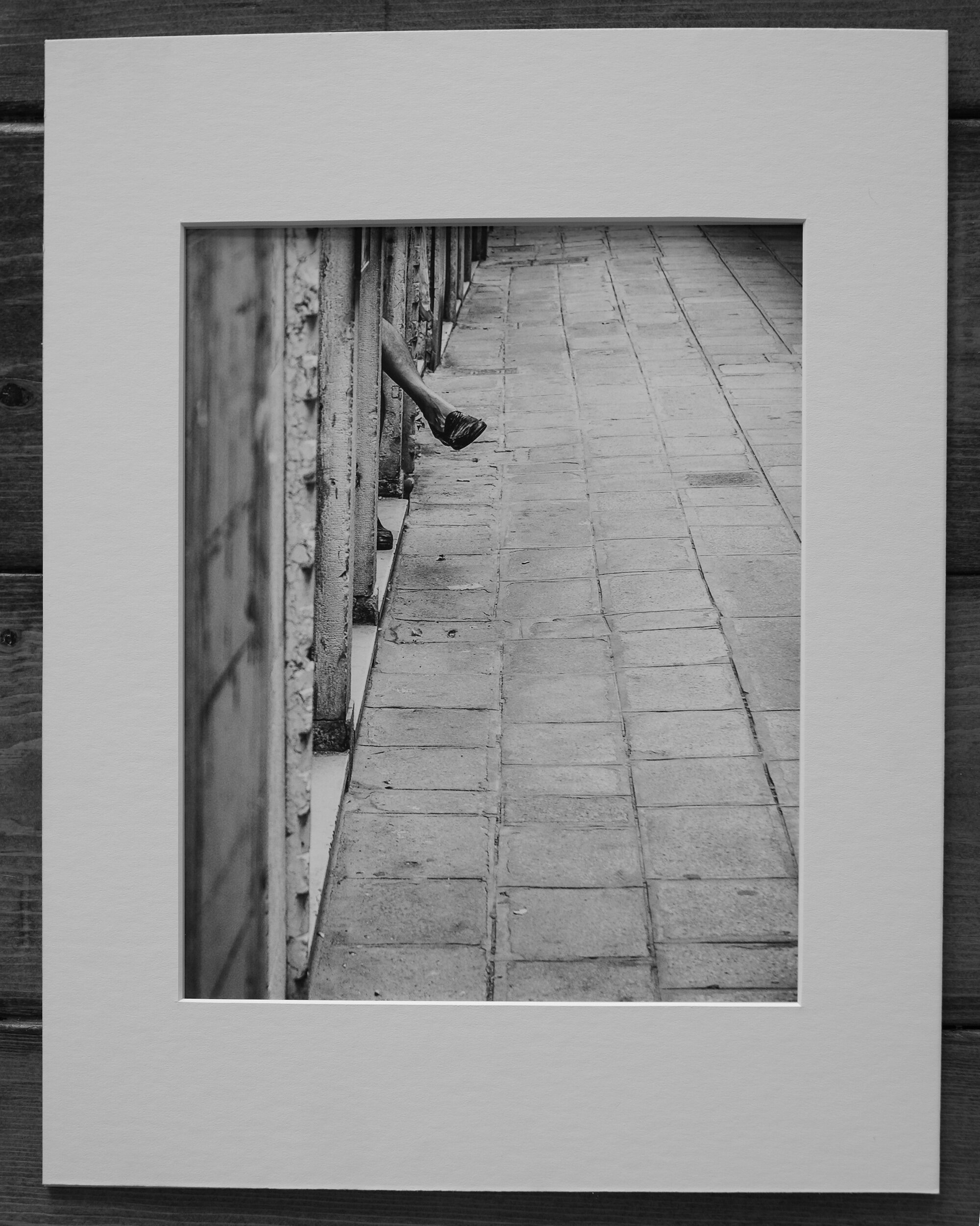
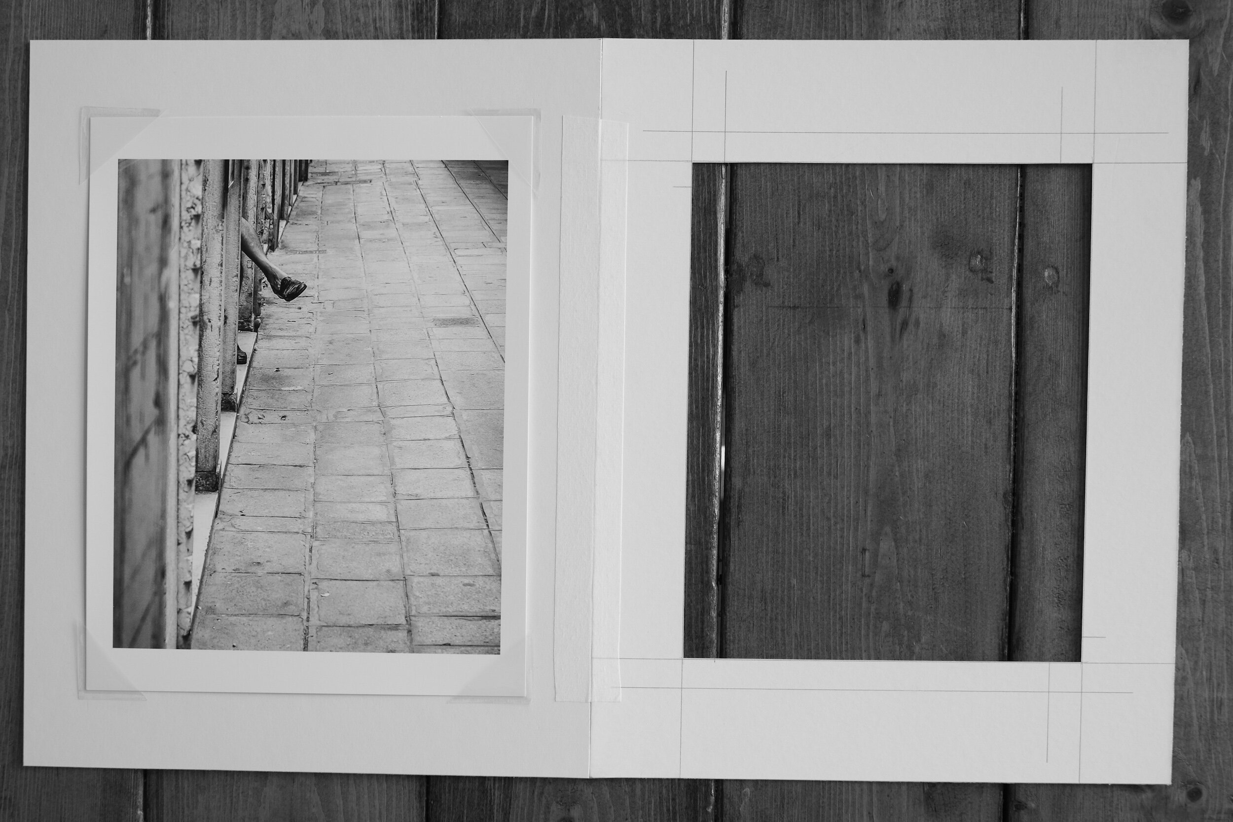
First, you need to decide what size and color mat you want, and what size the mat border and mat window should be.
A lot of this, of course, depends on your taste. Most photographic prints are framed with a white or off-white mat because this provides a nice clean look and the least distraction from the print itself. In some cases, however, it might be appropriate to use a colored mat. Using a color, for example, that matches the color scheme of the print. Or with black-and-white images, a black mat might add drama to the overall effect. It is also possible to use a colored mat with white cutting edges or to use two mats slightly different in size to create depth to the framing. This is an area where a framing shop can advise and show different settings.
With regard to the size of the mat, you should also consider if the mat window will be exactly the size of the print, or slightly bigger. Limited edition, signed prints can have the signature and other information written under the image. It is a matter of preference if you want to show or not show these. If the image is printed on deckle-edged paper (paper with ragged or feathered edges) you might want to have the window of the mat a bit bigger on all four sides to show the paper edges.
If you choose for a mat window that matches the size of the print, you need to keep in mind that the mat window usually will be slightly smaller than the print size (1/16 to 1/8 inches on all four sides) to ensure the print will be fully enclosed by the mat.
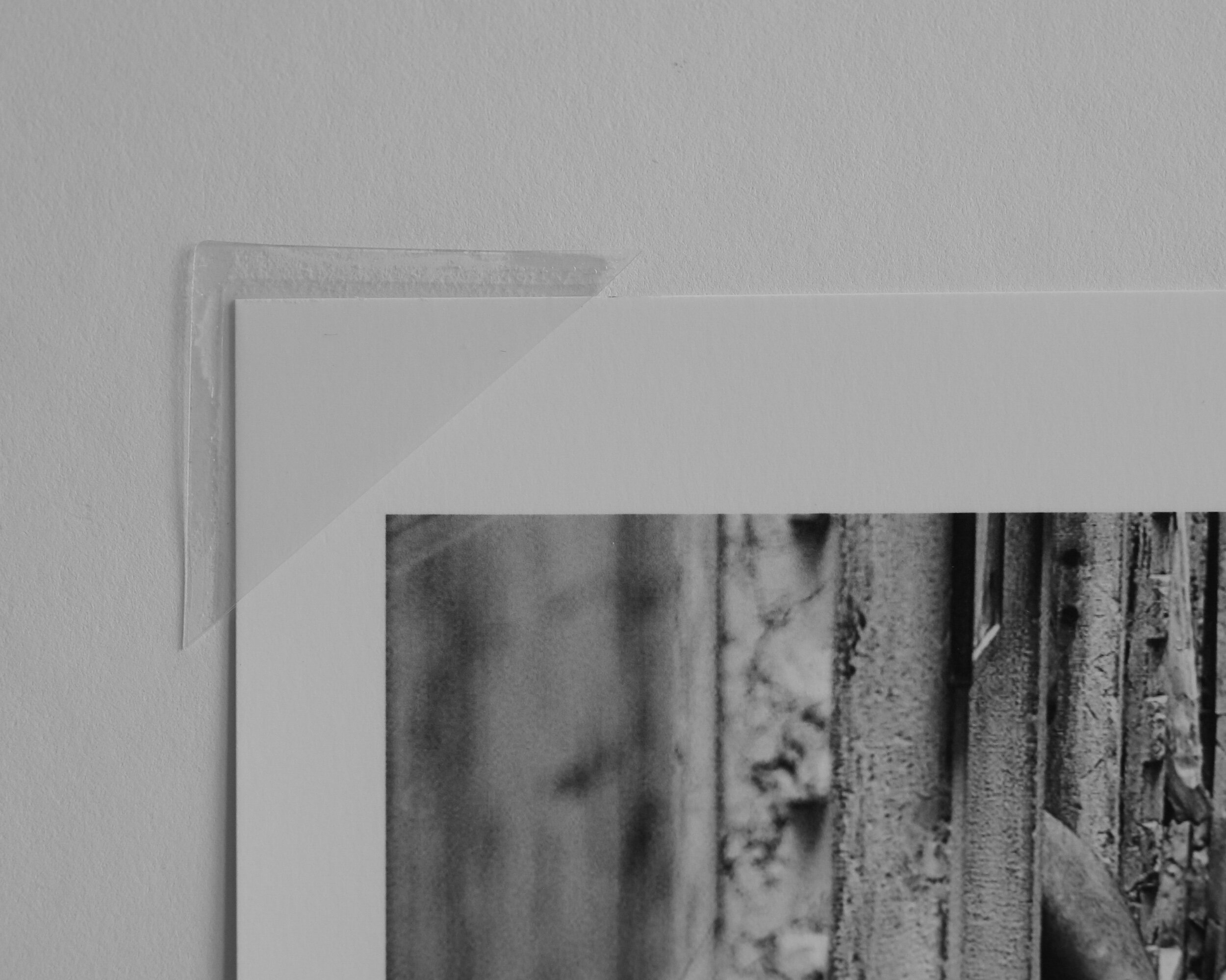
You also need to decide on how the print will be mounted to the backboard. The best way is to use photo corners. This allows the print to ‘breathe’: whatever environment you will display your prints in, and irrespective of how closed the frame is, there always will be some impact from humidity. Having the print loosely fitted with photo corners will allow it to expand and extract without creating wrinkles. If needed, the photo corners can be strengthened with mounting or hinging tape (just make sure the tape does not touch the print).
Alternatively, you can mount the print to the backboard with mounting tape. This, however, I do not recommend because you are attaching something to the back of the print that might be difficult to remove, which might impact the value of the print and at the least will make it more difficult in case you want to re-mat the print in the future.

One point of caution: whatever you do, do not dry-mount your print to the backboard!
With dry-mounting, the print is permanently fixed to the backboard. This not only can impact how the print looks (in some instances the structure of the backboard can be visible through the print); dry-mounting is not considered an archival safe way to mount prints and it definitely diminishes the value of your print.
Lastly, and this might be a no-brainer, but don’t forget to always use archival quality (acid-free) materials. The acidity of regular paper and board will impact your print in the long-term and lead to discolorations.
Framing
The next step in preparing your print for display is framing.
The frame serves two purposes. The first is to protect the print from dust, dirt, and light. The second is to display the print in the best possible manner.
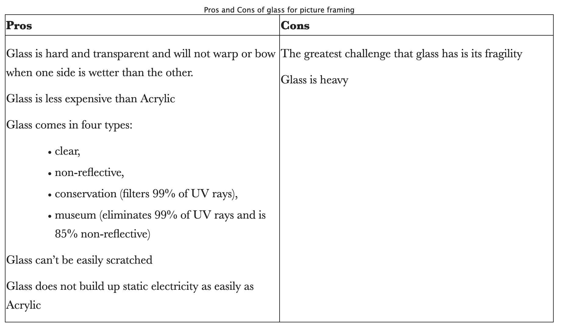
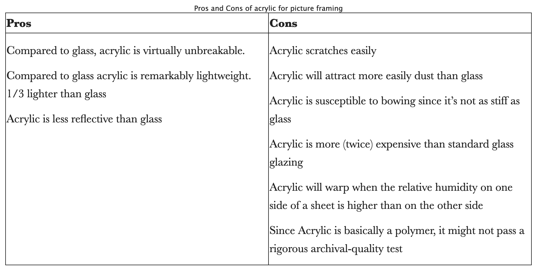
In order to protect the print from light and dust, the frame will be closed at the front with glass or acrylic.
My personal preference is to use conservation or museum quality glass. Acrylic, however, can be considered a good alternative. To help you make the choice that best suits your needs the tables below provide the pros and cons of both.
The front glass and the mounted and matted print will be placed in a frame that holds everything together. The frame will also need to match the print to display it in the best possible manner.
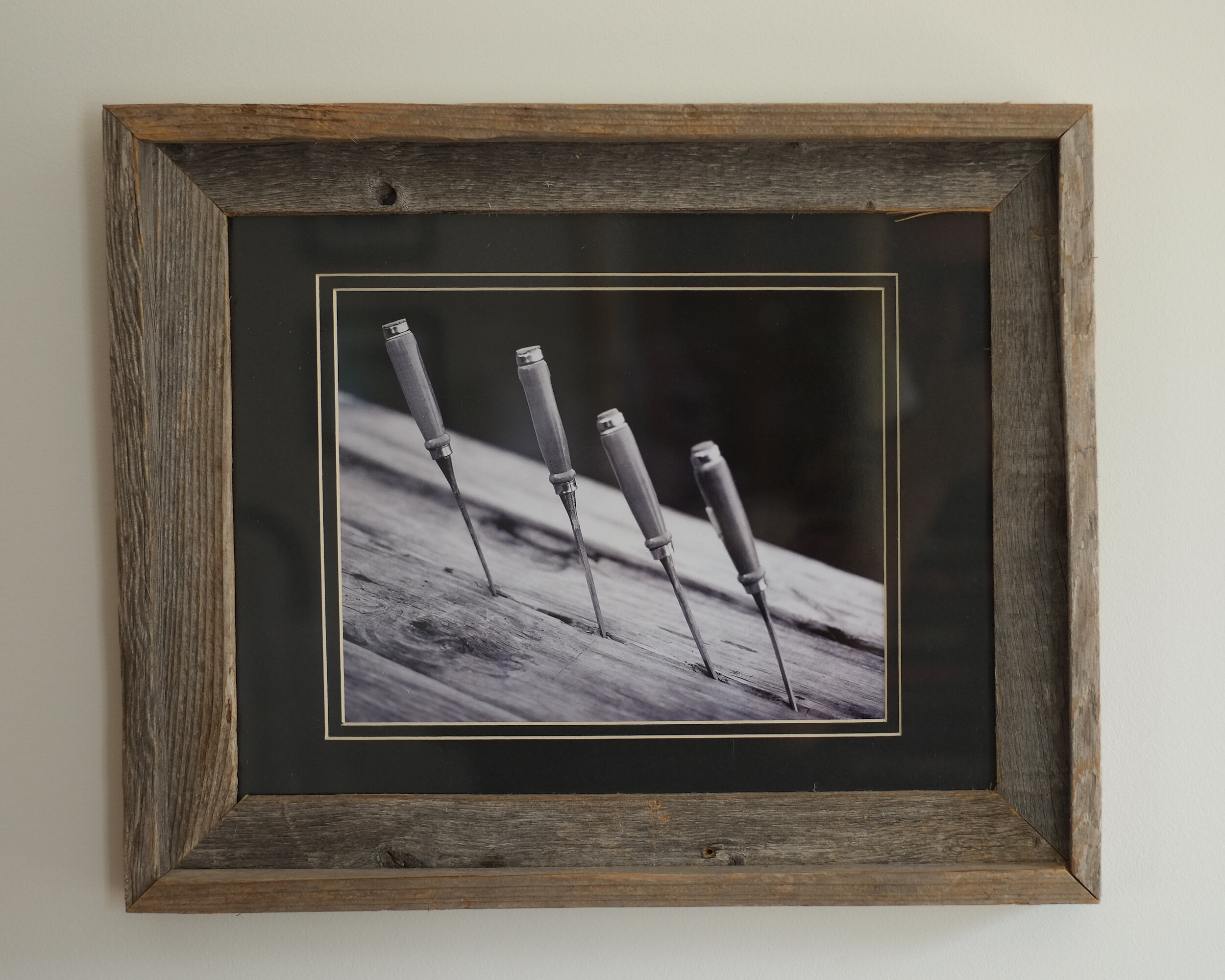
Frames are available in a multitude of materials, colors, and sizes. My preferred frame is a simple, unadorned, black frame that size-wise (width) matches the size of the print and the mat borders. The material of the frame can be wood or metal. This sometimes also is called gallery framing.
Depending on the color scheme of the print, the subject of the image, and of course your personal preference, nothing, however, prevents you from using very broad frames, colored frames, ornamental frames, etcetera. The choices are practically unlimited.
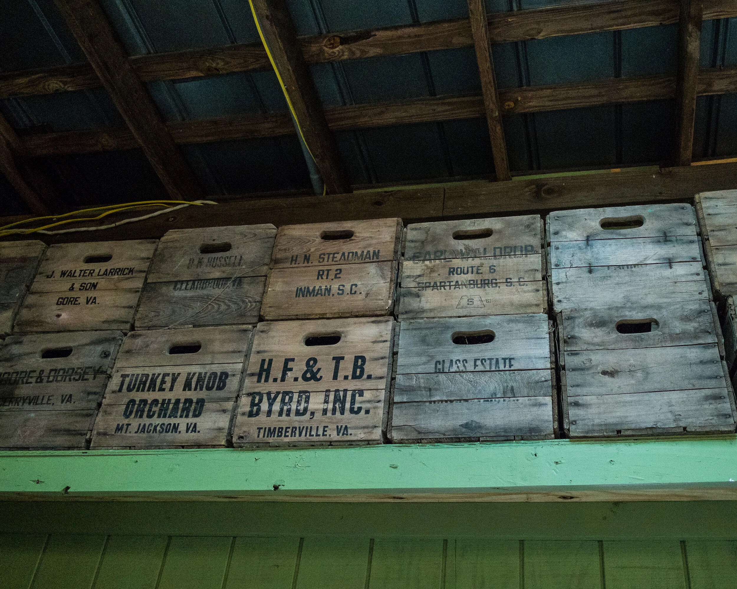
I actually have a couple of black and white prints of chisels mounted in reclaimed wooden frames. The wood of the frames matches and adds to the structure of the wood in the prints, which in this case enhances the impact of the print.
Displaying fine art photography
Now you have a matted and framed photographic print ready for display.
The usual way to display your print would be hanging it on a wall. Depending on the size of the framed print, and whether it is part of a series, you might consider hanging it on its own to create a specific focal point or arrange it within a group of prints.
I have created this Pinterest Interior Design board, to provide some ideas on how to group framed prints.
Another way, however, to display one or more framed prints is to put them on a shelf. Since you don’t need to put any nails in your walls or install expensive rail systems, you might consider this when you want to be more flexible with your displays, for example when you have several prints you want to change on a regular basis.
However you want to display your framed prints, keep in mind that it is always best to avoid direct light, even when you invested in conservation or museum grade glass for framing.

Why I Shoot Film in 2018
An explanation for why I continue to shoot film in 2018
When I started this blog back in 2015 I published several articles to explain why I recommend photographers to…
An explanation for why I continue to shoot film in 2018
When I started this blog back in 2015 I published several articles to explain why I recommend photographers to continue shooting film.
Film photography is making a great comeback, with increasing numbers of photographers going back or starting with film and new and existing film manufacturers producing new types or restarting the production of a previously discontinued film. The latest example being Kodak, who announced to bring back T-Max P3200.
While I have several 35mm and medium format film cameras, I still am using my X-Pro1 more than my film cameras and I love the versatility of digital. For me, these are two different worlds, and I am lucky I can live in and with both
So what are my reasons to continue shooting film?

You need to be disciplined and follow a set process
Most of the older film cameras do not have any auto mode settings. You all have to do it yourself: transporting the film to the next frame and cocking the shutter, setting the shutter time, choosing the aperture, focusing, and of course taking the picture. In some cases you even have to do all these in a specific order to prevent damage to the camera. As a consequence, shooting film will slow you down quite a bit, helping you to really think through why you are making specific adjustments to your settings.
Furthermore, you only will see the results of your actions hours, days, or even weeks after taking the pictures. No chimping... You better spend some time on making sure that the composition is right, that your lens is clean, and that you exactly have in your frame what you want to be in it.
You need to know your photography theory
As I mentioned in the first post on this topic, most of the older film cameras do not have any auto mode settings. You all have to do it yourself: transporting the film to the next frame and cocking the shutter, setting the shutter time, choosing the aperture, focusing, and of course taking the picture.
Since you have to change settings manually, you really need to know what you are doing: why for example are you choosing a specific aperture, or specific shutter time. You also can not switch film sensitivity between shots (some medium format cameras, however, have changeable film backs, which do allow you to actually use films with different ISO values). Yes, even before you go out to take pictures you need to think about what kind of images you want to capture. Is it very light outside, or dark? Do you need to freeze motion, or do you want to blur motion? To answer these questions and make the right decisions for the pictures you want to achieve, you need to know a bit more about photography and light theory than when working with a full automatic digital camera that can adjust ISO settings 'on the go'.
For some shots, film is just better
In my opinion film still has more detail retention in highlights and shadows than electronic sensors can capture. There is no need for HDR photography, because film is HDR. Film has a huge dynamic range, with even gradation from dark to light tones.
Of course, it is up to you to choose the right shutter speed and aperture to achieve this. Keep in mind, however, that there is no such thing as the 'right exposure': you decide what feeling, mood, and effect you want to create with your shutter speed and aperture selection.
And then there is that specific film look: blogs are filled with discussion about whether film images actually look different from digital images. And what to think about the numerous "film" presets available for digital post-processing software. Probably a lot of personal taste is involved, but to me for some pictures film just works better.

You spend less time in post processing
First of all, since you only have a limited number of exposures per roll you probably will be more selective about taking a picture. As a result you will have less pictures to go through per session, which of course will save time when reviewing and selecting your best images.
But even more important, it is my personal experience that a well taken picture (i.e. correct shutter time, aperture and sharpness for the result you want to achieve) on film needs less post processing than a well taken digital picture.
Here I have to admit that at this moment I am only shooting film, not developing. I send my rolls to a professional lab for developing, scanning and printing. I upload the scans into Lightroom for minimal post processing and publishing on my portfolio pages.
You actually will have pictures in your hand
Although I love to share my pictures via Zenfolio, I sometimes also want to have the tangible product. When shooting film it is just easier for me to get actual prints: I usually order them when I have the film developed and scanned. No need to go through the process of preparing the image in Lightroom for printing and taking or sending the digital file to a lab or printer, or printing it at home. And to be honest: as a result of these additional steps needed, most of my digital pictures only live in the digital world.
This was the last post in this series about five great reasons for shooting film. There is actually one bonus reason: it is just fun to fiddle with the mechanics of a film camera, going through all the actions to make sure all settings are correct. It is just more fun than working with the digital stuff, even if you are shooting your dSLR or mirror-less camera in 'full manual' mode.
So do I like to shoot digital? Yes! Do I like to shoot film? Yes! Depending on the situation I choose for a specific medium and way of creating images. I strongly believe both digital and film have their merits, and I will continue to use film as long as there are film cameras and as long as there is film.
-------
I hope you enjoyed this background story about my reasons to continue to shoot film. Don't forget to subscribe, to ensure you will receive new information like this delivered to your email inbox the moment they are published.
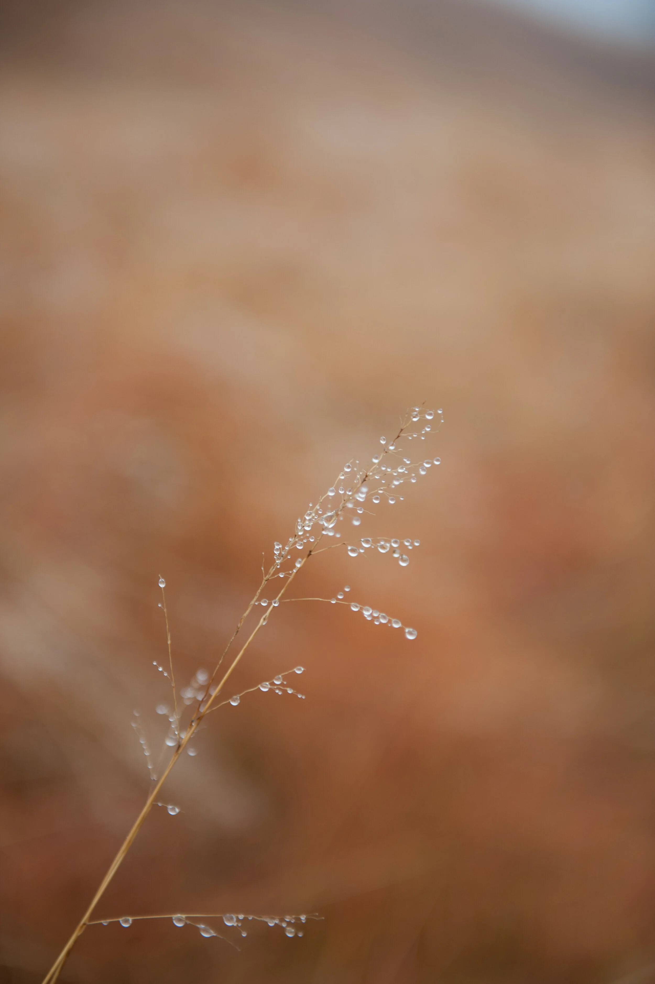
Image Of The Month: Grass With Water Drops
Grass With Water Drops' Behind The Scenes
The image I am going to discuss today was taken in July 2010, and final changes for publication were made in 2017.
'Grass With Water Drops' Behind The Scenes
Taking the Picture
The image I am going to discuss today was taken July 2010, and final changes for publication were made in 2017.
In 2010 my family and I lived in South-Africa, and my wife's sister with her husband and two kids visited us from the Netherlands for their summer vacation. Although our initial plan was to rent an eight-person Landrover (but that is a story for another time), we rented the ubiquitous Toyota Hiace van and made a round trip from the Johannesburg area where we lived to Durban, stopping at a couple of safari parks and staying at camp sites and lodges.
One of our overnight stops was at Didima resort, located in the Cathedral Peak valley of the u Khahlamba Drakensberg park, approximately halfway between Johannesburg and Durban. The resort has several cottages with great facilities, and we rented two cottages for my and our sister in law's families. The area surrounding the resort is great for hiking, and it was during one of our hikes when I noticed some nice high grass with early morning dew drops clinging to it.
At that time I still had my Nikon D700 camera (read a previous post to learn why I sold this gem), and I used the 24.0-70.0 mm/f2.8 lens to capture it. The D700 is a full frame sensor camera, and for this image I shot it at 70mm focal length. Since I wanted the grass and water drops stand out against the background, I created a very shallow depth of field by selecting the f2.8 ("wide open") aperture. This led to a shutter speed of 1/320 second.
Creating the Image
Since I only started this website in 2013 with real activity only starting in 2017, this image like too many others had been living on my computer's hard drive without seeing any action.
The Nikon D700 has a sensor that produces images with an 2:3 aspect ratio, my preference however is for images with 4:5 and 1:1 aspect ratios. I therefore had to crop the original image to create versions with these aspect ratios for publication and printing. In addition, I wanted a 1:2 aspect ratio version because that was the format more easily accepted by Twitter.
Furthermore, although the original image as created in-camera was not unsatisfactory (see below), I wanted a more dramatic and abstract view. In other words: there was work to do.
The image as created in-camera / 2:3 aspect ratio
Adobe's Lightroom provides me with all the tools I need for what I want to do and accomplish with my images, and I try to use as less of its tools as possible to achieve the final results I have in mind applying all tools from top to bottom as they appear in the Develop menu: Basic, Tone Curve, HSL/Color/B & W, Split Toning, Detail, Lens Corrections, Transform Effects, and Camera Calibration.
Color Versions
For the color version I adjusted the Basic, HSL, and Detail sliders as shown below.
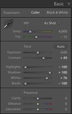
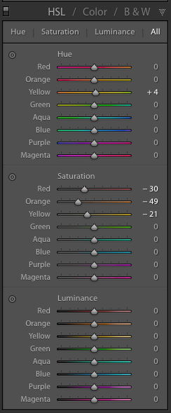

Although the saturation changes for the Red, Orange, and Yellow colors are very important to create the effect I desired in the color versions, the most important changes I made were in the Basic section by reducing the Highlights and Blacks to the maximum, increasing Shadows to the maximum, and increasing the Whites to 76% of maximum.
This means that any Highlights in the image have been reduced to almost zero, and the Black areas in the image have been made as black as possible. The shadows have been made as light as possible and any white areas have been made almost extremely white. I also added some sharpening and noise reduction.

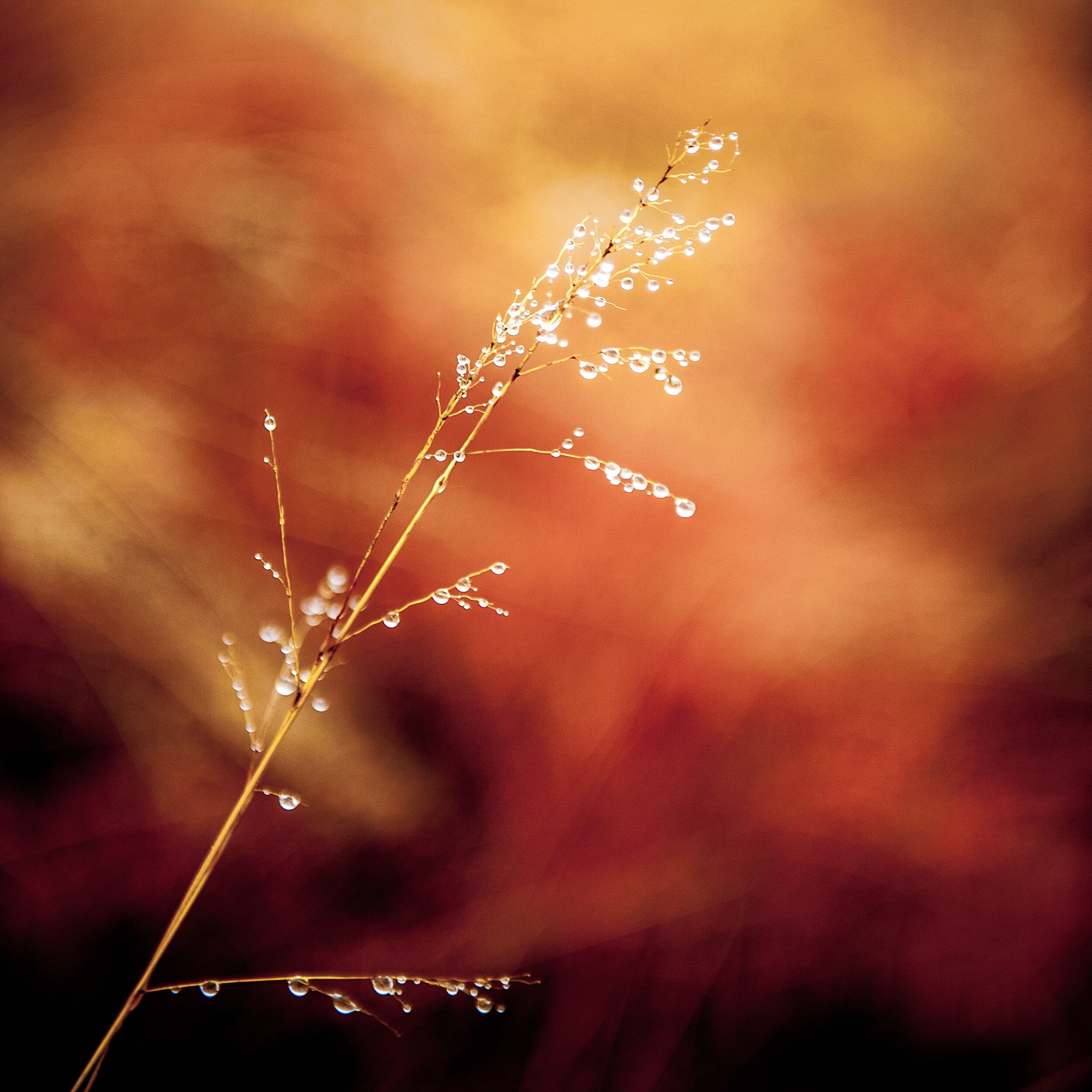
Since I wanted to have an additional color copy in 1:2 aspect ratio to use on Twitter, I had to crop again. This horizontal 1:2 crop was quite a challenge since the main object in the image has a vertical structure. In the end I decided to keep the top of the grass in the image, creating the result below.

Black and White Versions
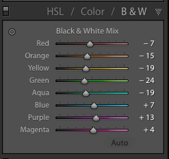
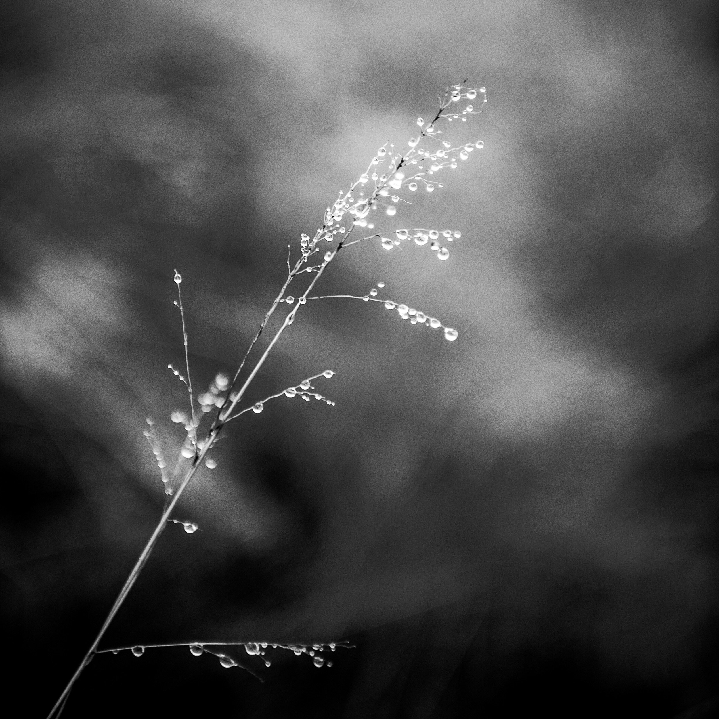
For the black and white copies I kept most Lightroom settings the same as for the color ones. However, to accomplish the best effect in black and white, I needed to play around a bit more with the color settings in the HSL/Color/B&W panel.
Resulting in the following result (after cropping to 4:5 and 1:1 aspect ratios respectively.

Final Thoughts
I am quite pleased with the final results.
In both the color and black and white versions the shallow depth of field separates the main subject very well from the background. This effect has been enhanced by the adjustments I made in Lightroom, with quite a dramatic effect in the color versions.
The original composition works very well after cropping to the 4:5 and the 1:1 aspect ratios. In the 4:5 version, the direction of the grass follows almost exactly the diagonal of the image rectangle. Although the 1:2 version was predominantly created to comply with Twitter image requirements, it actually produced a very balanced composition with more focus on the detail at the top of the grass.
- - - - - - -
I hope you enjoyed this background story about the creation of the Grass With Water Drops images. Don't forget to subscribe to ensure you will receive new information like this, and Haiku, PicTales, and other stories delivered to your email inbox the moment they are published.
Turning a Disaster Into a Blessing
How this week's Lightroom-Zenfolio Disaster Turned Into an Unexpected Blessing
I experienced quite a disaster last week when transferring updated images from Lightroom to Zenfolio, using Jeffrey…
How this week's Lightroom-Zenfolio Disaster Turned Into an Unexpected Blessing
I experienced quite a disaster last week when transferring updated images from Lightroom to Zenfolio, using Jeffrey Friedl's upload tool.
Whether it was a glitch in either of the programs or my own stupidity clumsiness, I probably never will know, but transferring a batch of images messed up my whole Zenfolio setup. Usually, this transfer works perfect and I really like how Friedl's upload tool makes moving images from Lightroom to Zenfolio a breeze. It also keeps the images connected: if you make further enhancements to an image in Lightroom, it will ensure the image in Zenfolio will be updated too.
Last week, however, something odd happened: after updating a batch of images in Lightroom, I went into Zenfolio and to my utter dismay I noticed that instead of updating the existing images a whole bunch (read: a lot!) of duplicates had been added. A quick check with the Zenfolio helpdesk learned that no other photographers had flagged this (yet). Since I could also not "redo" the transfer, I actually had to first delete all (yes, all!!) images from the Zenfolio Galleries and then upload all back again from Lightroom. And of course, deleting all images from the Galleries, also removed them from the Collections and the blog posts and other pages. I was not happy...
Fortunately, before I started the painful process of restoring the images, blog posts, and other pages I realized that the need to do this might provide an opportunity to review and cull my Portfolio images, and to look at the layout of some web pages.
So how did I change the disaster of having to re-upload all images into Zenfolio into a blessing?
Culling
My first step was to review the images in Lightroom I previously had moved into Zenfolio. Some of these did not make the cut anymore but were still needed because I used them in blog posts. These images now would be moved into a separate "blog only" Gallery.
4:5 Aspect Ratio Images
Then I looked at all the other images and I decided I wanted to re-crop these to the 4:5 aspect ratio and place them in two separate Galleries: one for all Black and White images, and one for all Color images. Having gained some experience with the 4:5 aspect ratio of the medium format images from the Mamiya RZ 67 Pro II, I really like it a lot and have decided to make that format my standard image aspect ratio. I then also decided to change the layout for these Portfolio Galleries in Zenfolio, to create a cleaner look.
The results are shown below, and I am quite happy with it
4:5 B&W only

4:5 Color only

1:1 and 2:1 Aspect Ratio Images
The next step was to look at images in square and panorama aspect ratios.
The challenge was, that these images resided in the same "blog only" Gallery as images I definitely do not want to have visible in my Portfolio. I therefore now have added two additional Galleries: one for square images (1:1 aspect ratio) and one for panorama images (most in 2:1 aspect ratio). Since the number of images in each of these Galleries will stay limited, both contain Black and White and Color images.
1:1 B&W / Color

2:1 B&W / Color

Haiku Page
Whereas I already had my PicTales and Essays pages nicely organized by using tables, I was not happy with my Haiku page: since I had not decided on a specific layout yet, the Haiku were just organized as a list. Because I had to re-import all pictures related to the Haiku anyhow, I also took the opportunity to re-design this page. The design I eventually decided on is aligned with the designs of the PicTales and Essay pages. This looks far better now.

Path Forward
As you can see, when things go wrong, it's sometimes for the best. I have been able to turn the Lightroom to Zenfolio disaster into a blessing by taking the opportunity to review my portfolio images, update images, update portfolio pages, add portfolio pages, and update my Haiku page.
A lot of work, that's for sure, but definitely worth it!
Am I done yet? Unfortunately no. I still have to add portfolio images, re-add images to old blog posts, PicTale, Haiku and Essay pages, and add Portfolio images to specific Portfolio Collections (e.g. Abstract and Still Life, Transportation, Animals). So my site is not 100% up-to-date again yet, something I hope to accomplish over the weekend.
But it looks already a lot better and I am very happy with the changes I made. The new setup and layouts also align better with what my viewers are looking for: separate pages for Black and White, Color, Square, and Panorama images, and some pages for specific subjects like Abstract and Still Life, Transportation, Landscape, etcetera. I hope you also like what I have done, and I appreciate your feedback in the Comments section below.
Black and White Versus Color in Photography
What works better: black and white, or color images?
Browsing through my pictures to see what subject matter I like most to create images of, the other question that…
What works better: black and white, or color images?
Browsing through my pictures to see what subject matter I like most to create images of, the other question that always pops up is: what do I like more, black and white or color images. As I mentioned in a previous post, I have a preference for black and white images; the real answer to this question however, as always, is: it depends...
Below I will share some examples and thoughts on each of these, but first lets have a look at
5 Factors to consider when selecting black and white versus color images
Every image has the potential to work best in black and white or color, depending on:
1. General subject matter;
2. The amount of texture and patterns;
3. The amount of contrast;
4. Whether color is a defining factor for the image;
5. Where and how the image is displayed.
Now let's have a closer look at each of these factors.
1. Subject matter
Some subject matter in general looks better in black in white, while other in general looks better in color. Architectural photography for example usually looks great in black in white, while color is the way to go when photographing flowers and food. However, as we will see, in some architecture color is such an important part of the whole concept that representing it in black and white would leave the essence of the object out (think for example of Gaudí's creations). And whereas color in flowers usually is the reason for taking pictures, when there is a lot of texture it might work to create a black and white image. Food photography generally only can (or should) be done in color: most food and dishes just don't look edible in black and white. But of course, there's always the exception: remember Edward Weston's Pepper No. 30?
2. Texture and patterns
In general, when there is a lot of texture the subject just begs to be photographed in black and white. The monochrome brings out texture and helps the viewer focusing on the patterns.
3. Contrast
This is a bit of a tricky one: I am speaking of "light contrast" here, not "color contrast". When there is a lot of contrast between light and dark areas in an image, I advise rendering in black and white. The monochrome enhances the contrast and brings out patterns and texture. Of course, when there are a lot of contrasting (or complementary) colors in a scene, you definitely should use that to get your story across.
4. Color as 'defining factor'
As mentioned above, this often is the case when photographing flowers and food. But think also about scenes with a lot of complementary colors, and architecture that uses color. In these cases, it is almost a 'no-brainer' to use color images.
5. Display
All the above applies when an image is being looked at in general. But then you also have to consider that image on display. How does the image look in your interior? What looks great on a screen, or hanging in a gallery might or might not work in your own home or office. The total style of your interior (e.g. classic or modern, minimalist or cozy) and, even more important, the color scheme of your interior will have a big impact on how the image you are looking at will work, or not work, in its eventual place of display.
And then there is a big caveat to all of the above: in the end, it is your artistic vision and personal style that will help you define how you want to capture an image, or how it will work in your interior design! None of the 5 considerations I mentioned above is a rule, they are suggestions based on my personal vision and style. And suggestions, even more than rules, are there to be broken.
Some examples
Below I provide some images in sets of two: each set has a color and a black and white rendering of the same image. I will explain which of the two works best for me, and why (you can click on each image to get a bigger view).
What is your preference for these images? Leave your input in the Comments section below.
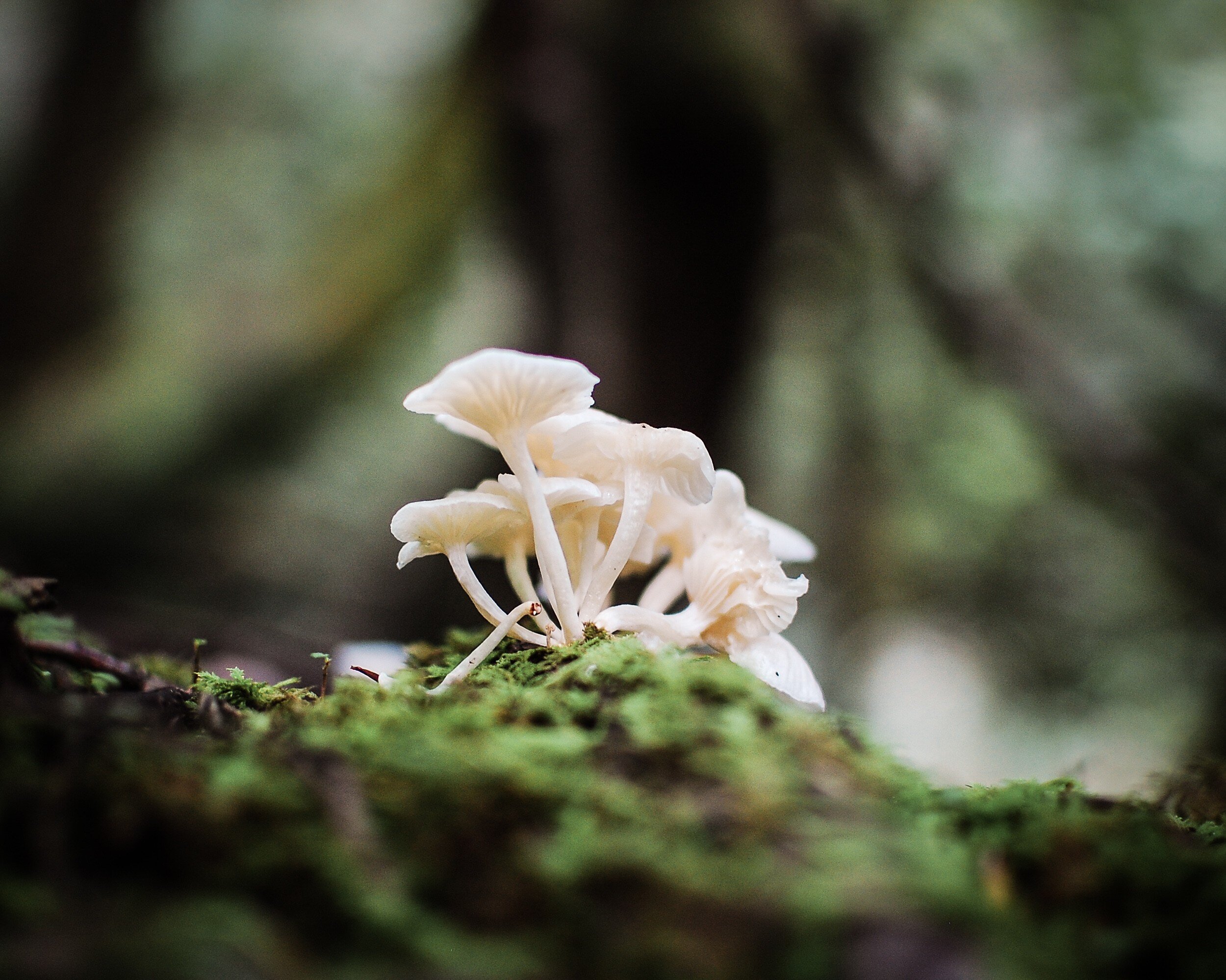
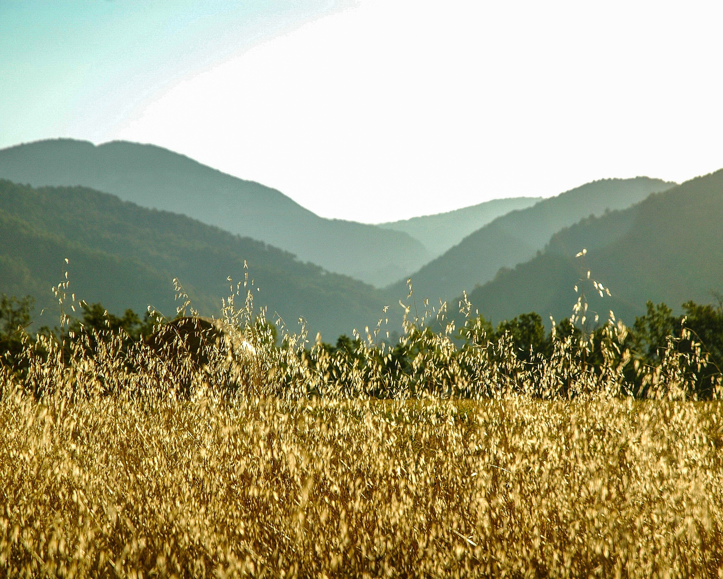
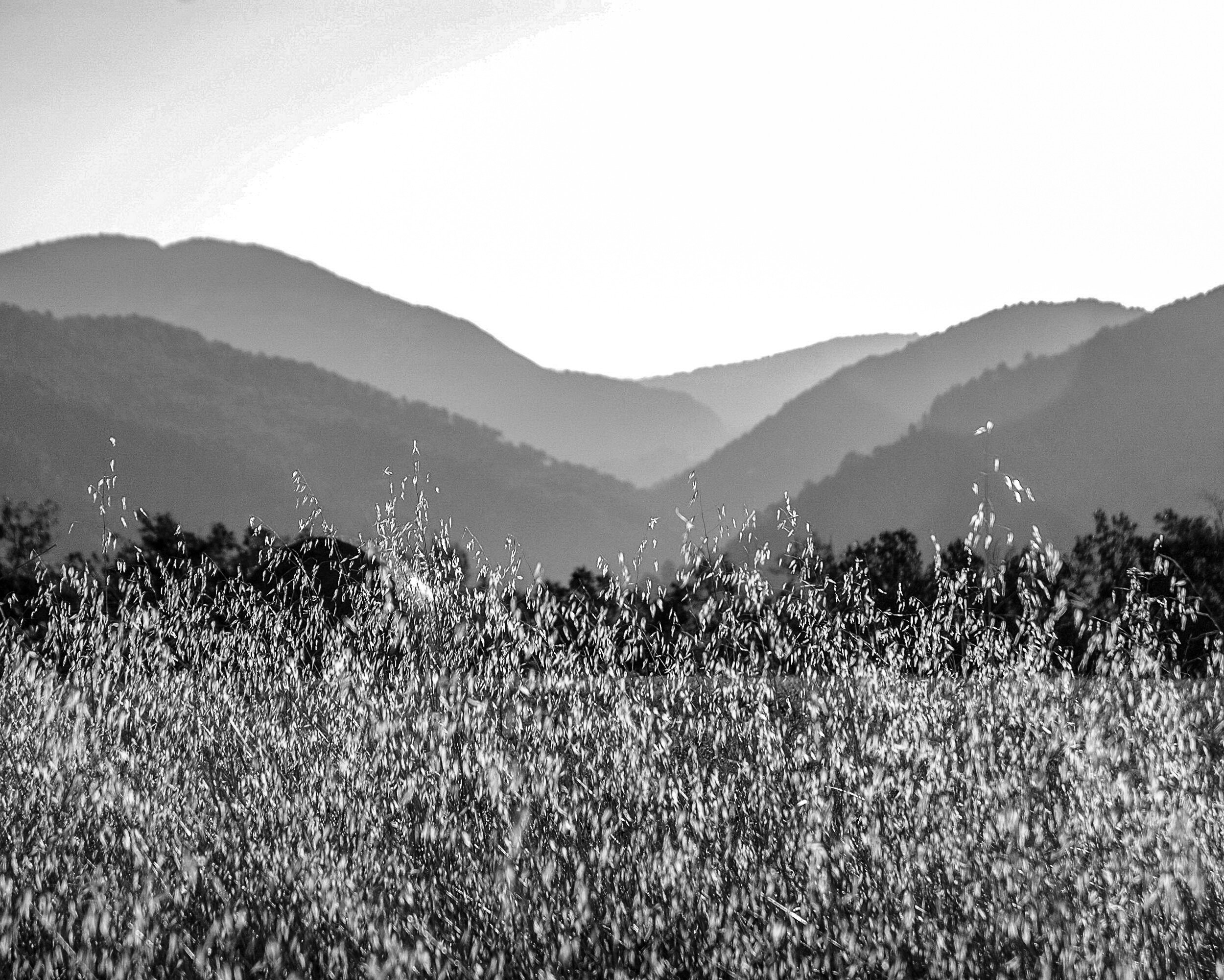
Grass With Water Drops
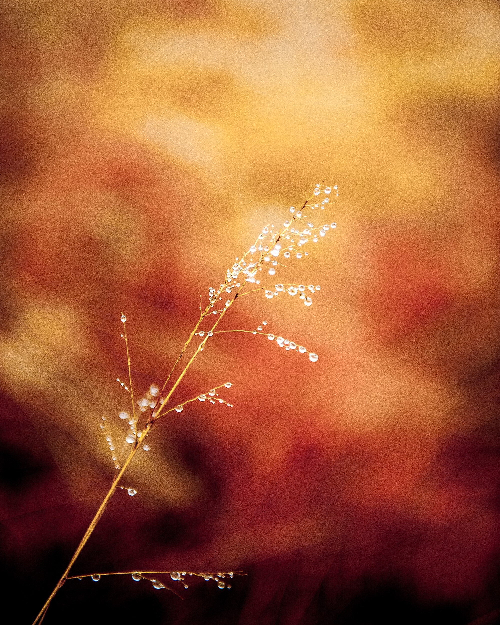
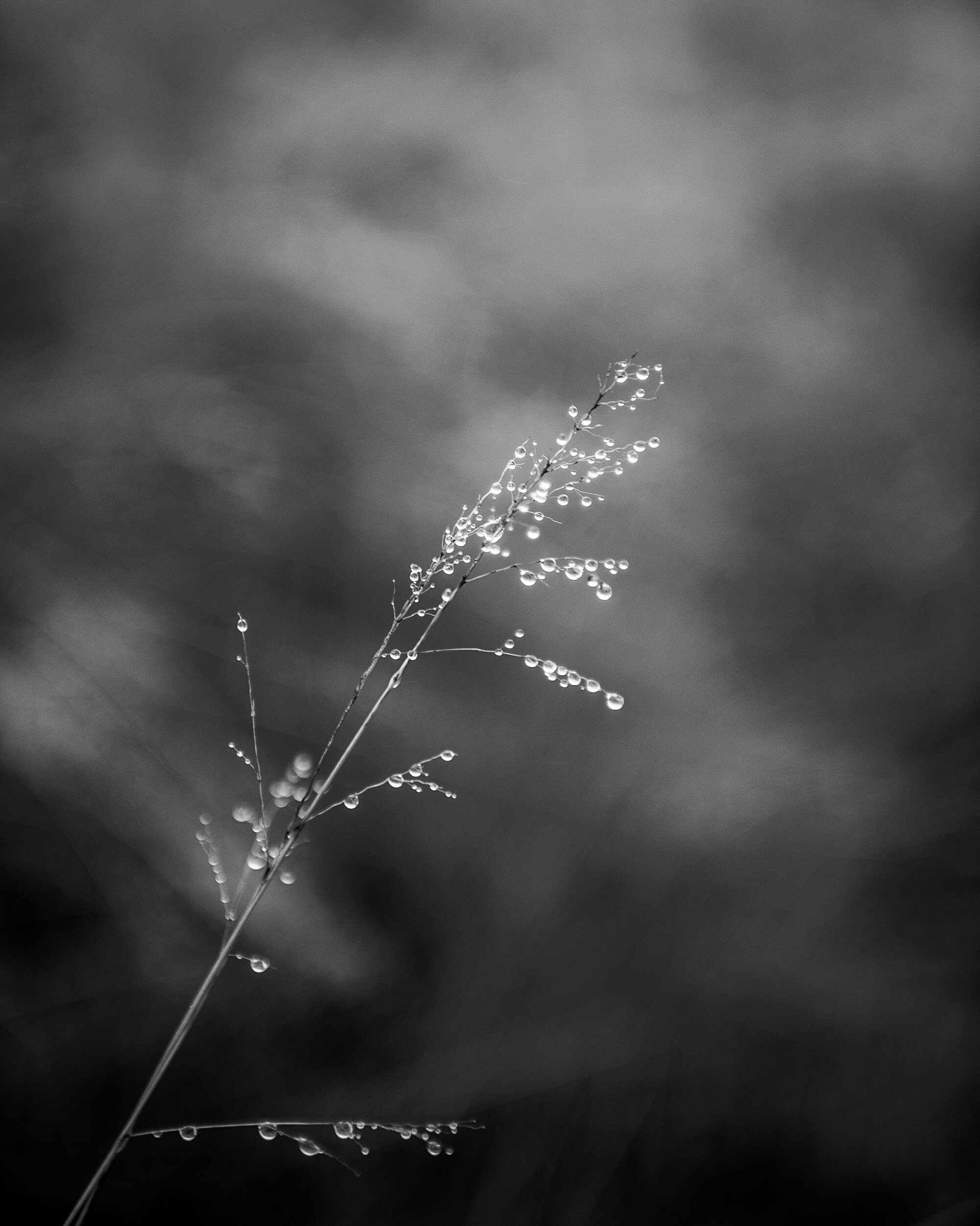
This first example actually is a very interesting one: I can not make a definite choice for a specific rendering of this image. I love how the black and white image brings the grass and water drops to the front and shows the texture of both. The several gray tones behind the grass form an interesting but non-distracting background. In the color image however, the background becomes an important part of the total picture. The reds, oranges, and yellows give the image a dynamic feeling while the grass and droplets still stand out as the main subject of the image.
The choice between these two images definitely needs to be decided depending on how and where it will be displayed.
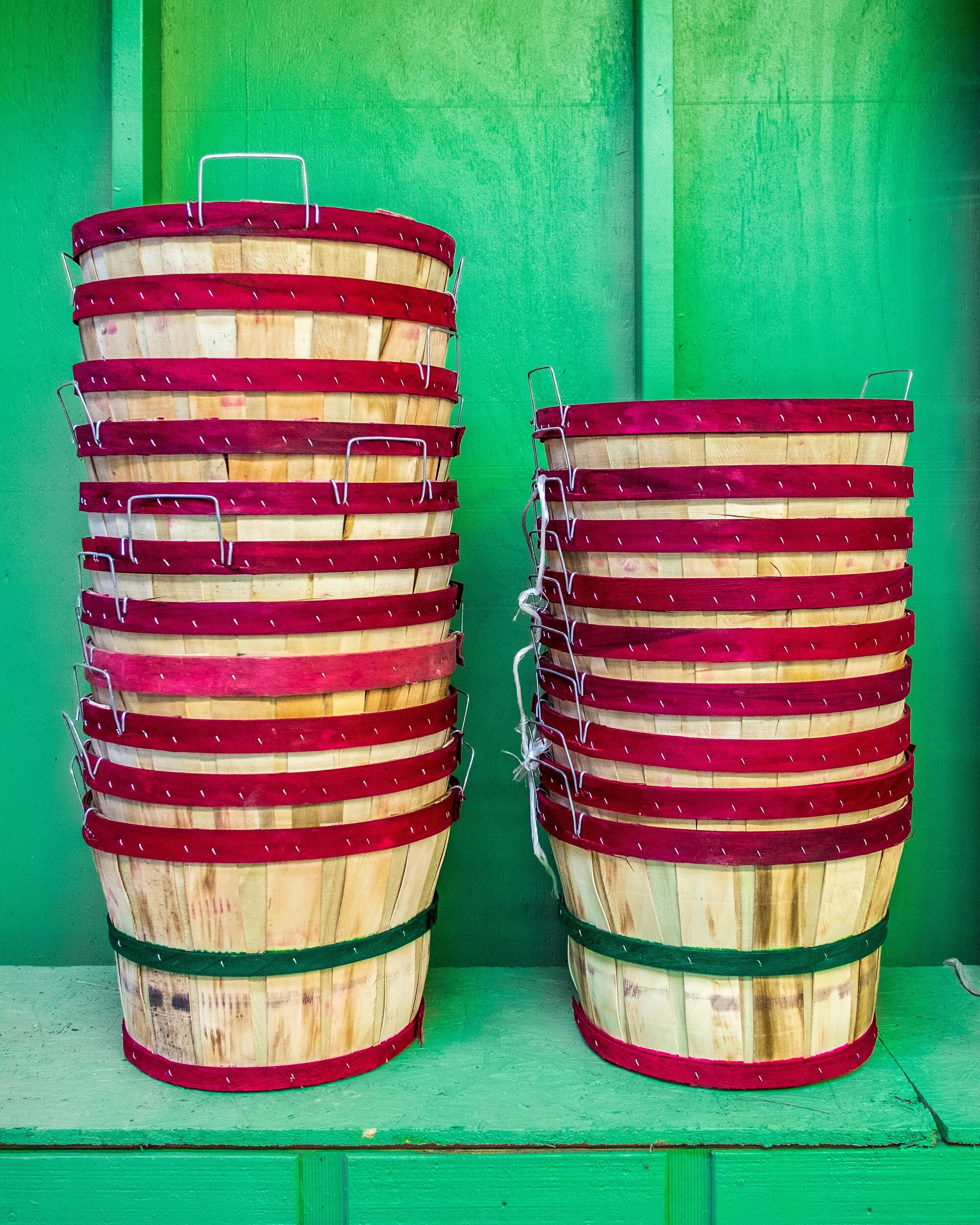
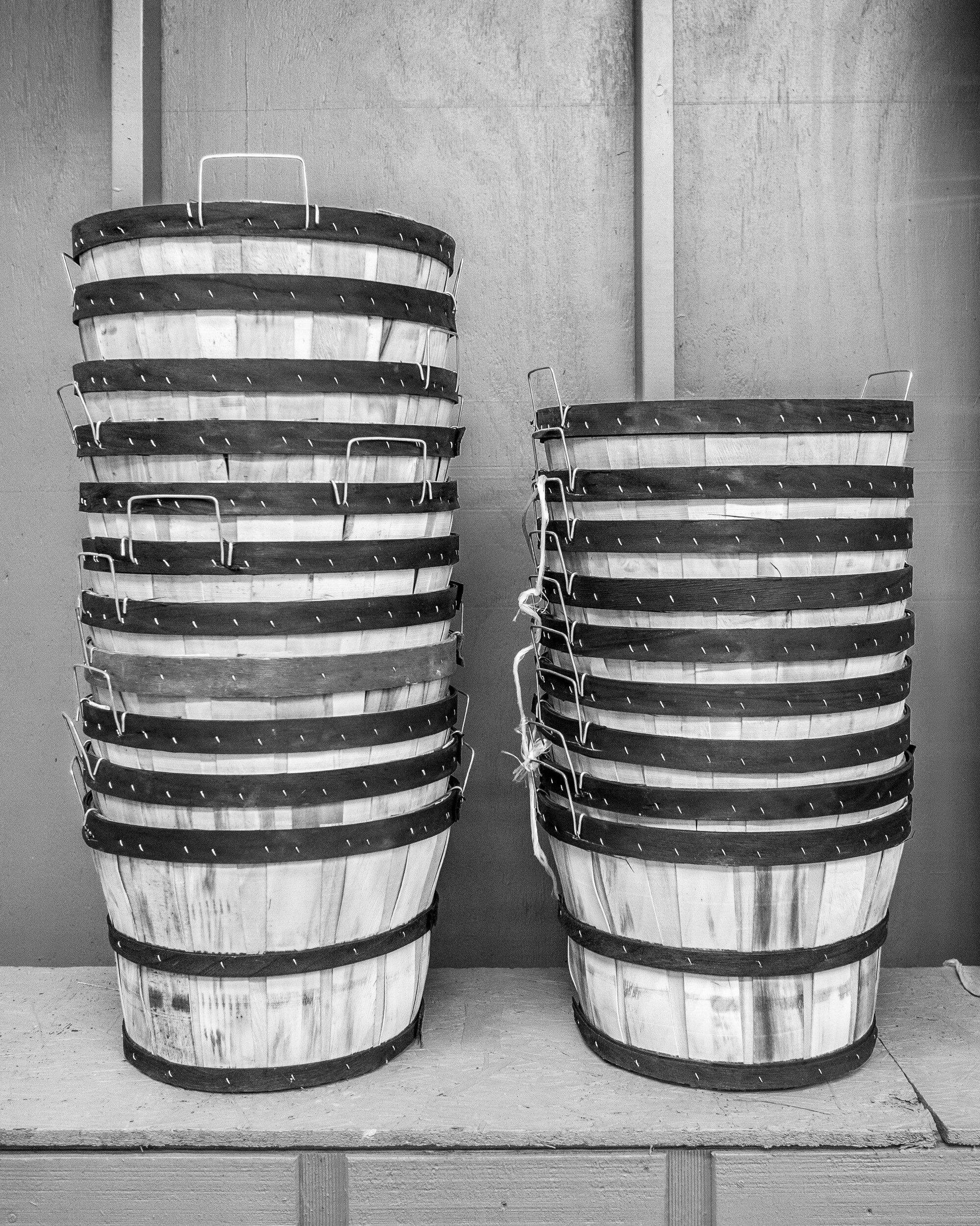
Stacked Buckets
Although the black and white version might work, for this image I definitely would go with color. The contrast between the red on the buckets and the green background really is of the essence for this picture. This is a good example of how complementary colors make an image work.
Boxed
In this case, the black and white version is my favorite. The boxes have subdued colors, and good texture. The colors of the boxes and the green of the shelf don't really add anything of interest to the image. The green actually distracts from the main subject: the boxes. The black and white rendering brings out the grain of the wood and the repeating pattern of the stacked boxes.
Red Roses
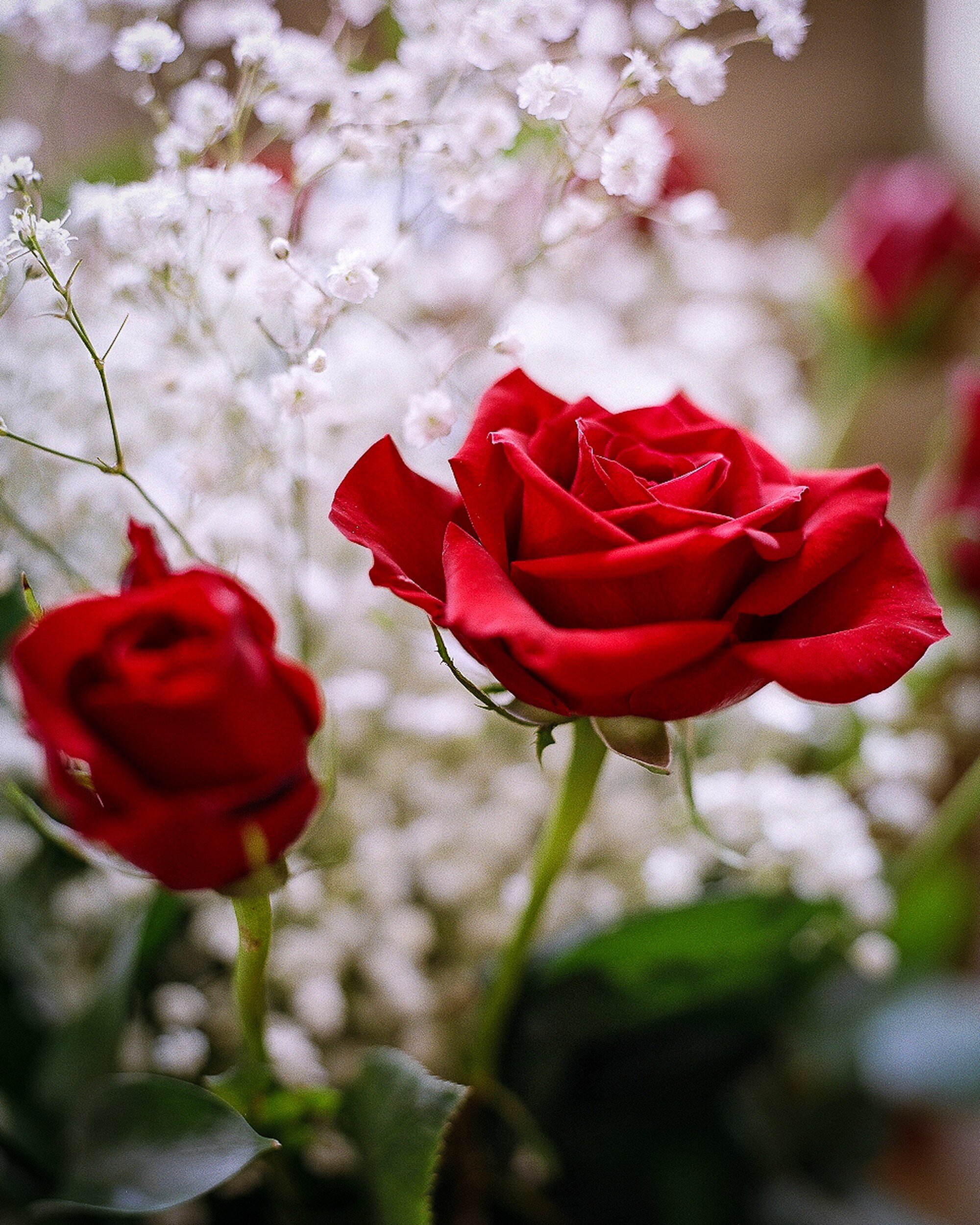
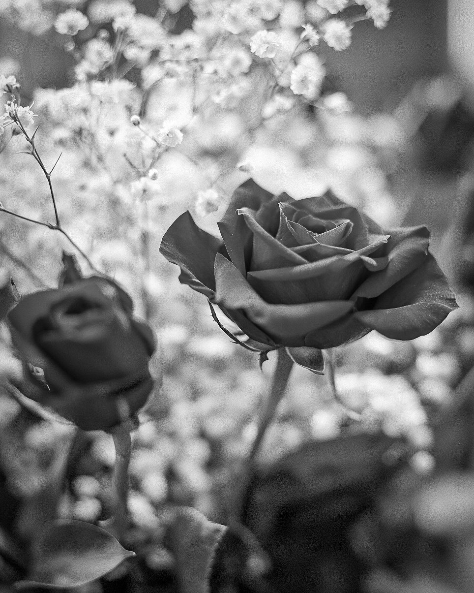
A nice example of photographing flowers. My first inclination would be to say that the color version works best: nice red roses, nice white flowers in the background, color being of essence. However, the longer I looked at this image, the more I started to like the black and white version: printed on a big format, and in the right interior this might actually work very well.
An important lesson learned here is that you need to take sufficient time to look at an image before making a decision on which version to use. While first impressions are important, you really need to digest what you are looking at and how it will work in your interior.
Mushrooms
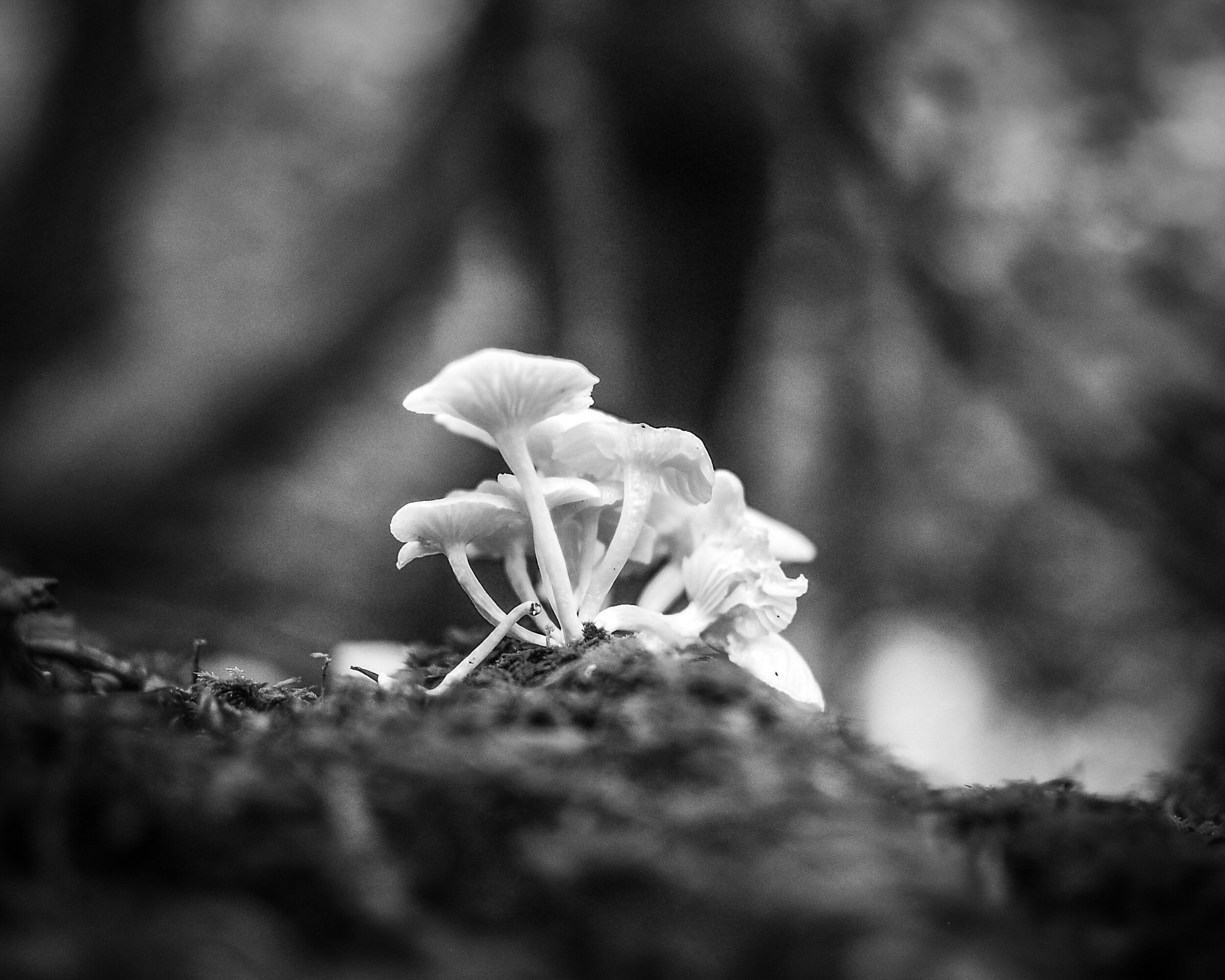
Here I had exactly the reverse experience from the one I had with the Red Roses Image. My preference was immediately for the black and white version: the shallow depth of field makes the mushrooms stand out against the background and the monochrome rendering makes background and foreground blend in and away from the main subject.
However, after looking longer at the color version I noticed how the green in the foreground actually helps to lead the eye towards the mushrooms. The dark vertical (a tree) in the background and the lighter triangles to the left and right of it help to lead the eye upwards; even more, than they do in the black and white version. Another example of taking the time to look and to digest the total image.
San Remo Apartments
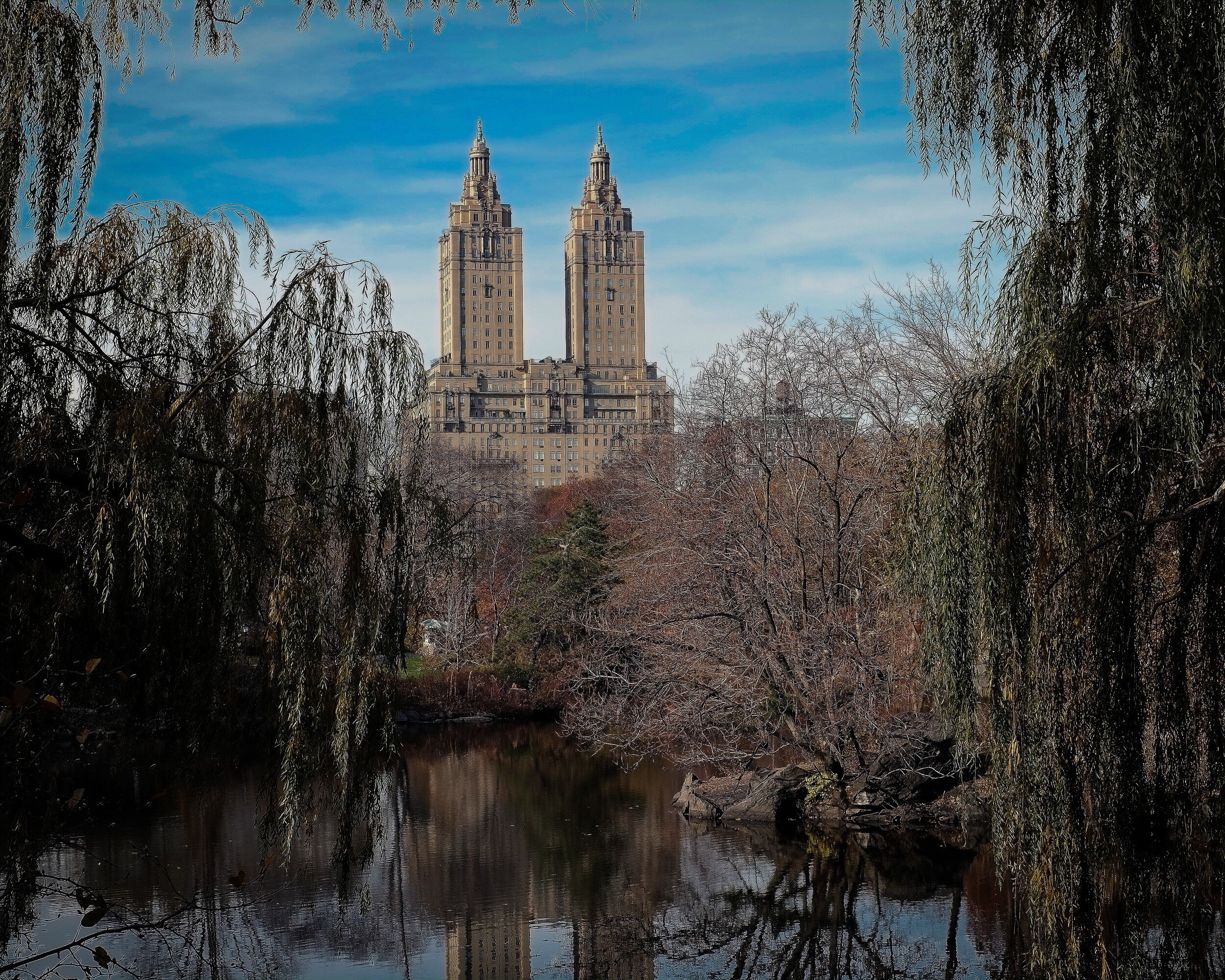
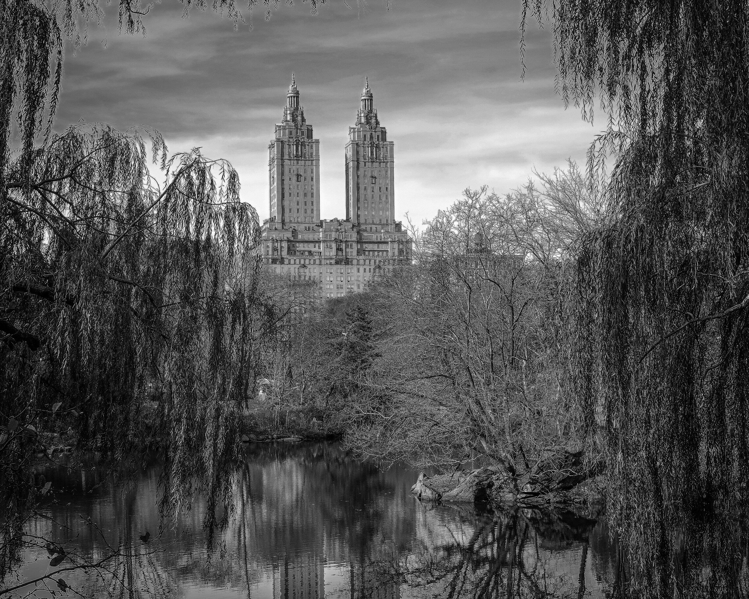
Architecture, so in general rule #1 says: black and white. But no, not really in this instance. Although the apartment building clearly is the main subject of this image (that it is nicely centralized in the image might provide a hint for this) the color of the trees, the pond (with reflection), and the blue sky are to me essential to this image. I don't think the black and white version doesn't work at all, but my preference for this image is color.
Campbell's Covered Bridge
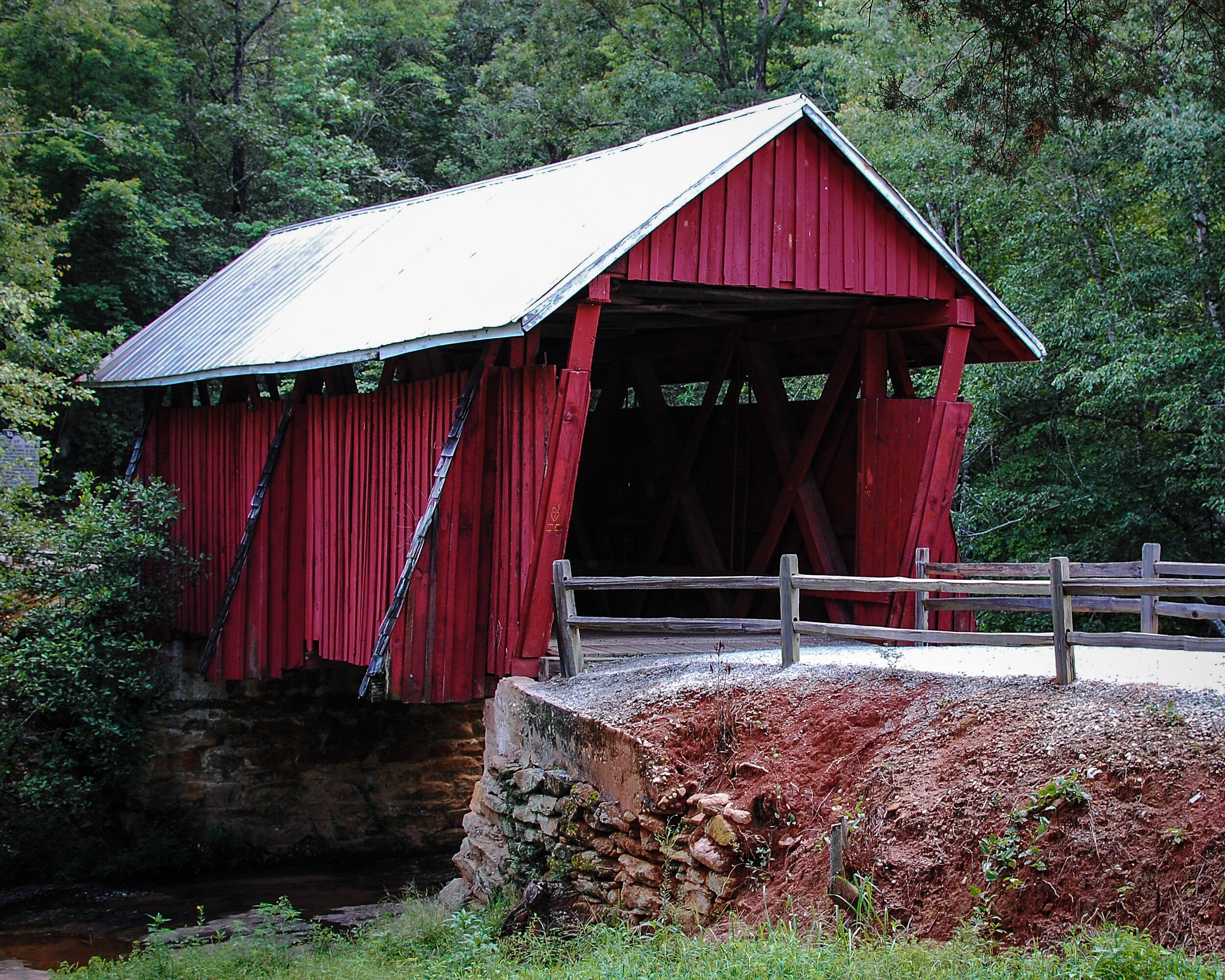
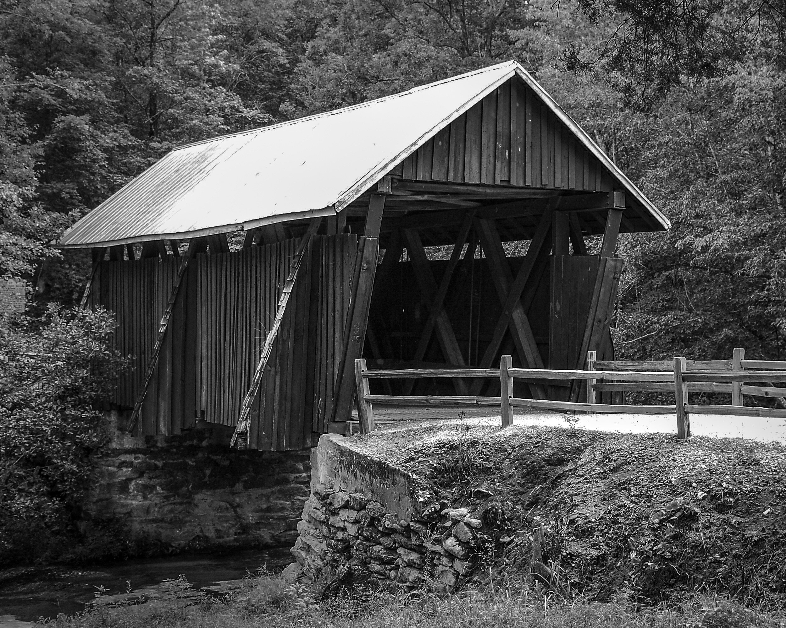
Another example where for me an image of an architectural structure works better in color than in black and white. The red paint is a very distinct feature of the bridge, and the juxtaposition of the red with the green of the trees in the background makes the bridge really stand out. The black and white version in contrast looks quite flat.
Capitol Hill


In this example both images work well for me. The black and white version provides a very clear and clean image of the Capitol and because the building is very light it stands out against the backdrop of the gray sky and the darker trees in the foreground. I like the color image because it shows the natural color of the Capitol's marble while it stands sufficiently out from the blue sky and green foreground.
Washington Monument
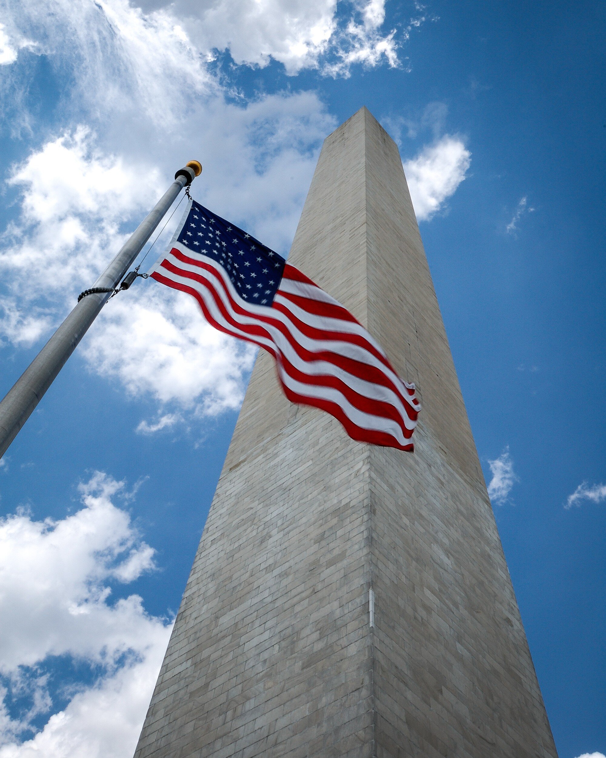
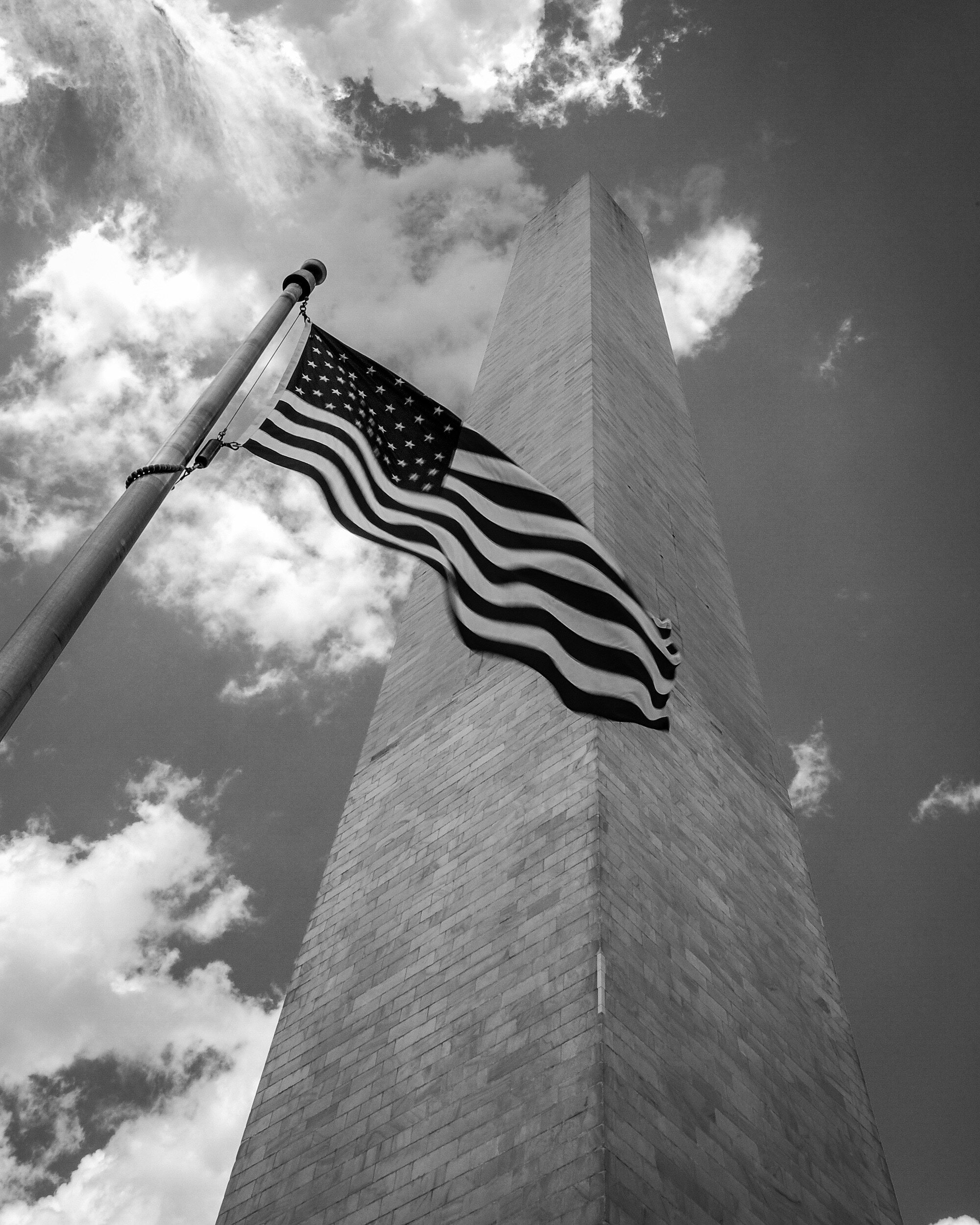
For me this image just needs to be in color. The bright red of the flag stands out; the dark blue of the flag is enhanced by the bright blue of the sky; the grayish color of the monument standing out from the blue and white of the sky directs the viewers eye clearly directed upward and provides depth. This does not happen as much in the black and white version because the gray of the monument blends with the gray of the sky.
Grain in Spain
This final example again is an image that works for me in color and in black and white. Because it has several shades of gray, the monochrome works quite well showing the different layers in the picture: from the light grain in the foreground, to the darker and mid-tones in the middle, and then some lighter tones in the background again. The color version works in a similar manner: the bright yellow in the foreground, and then different shades of green from the middle to the back going fro darker to lighter. While the different shades of gray or color lead the eye in bot images, the focus in the color image is more on the yellow grain in the foreground whereas the eye wanders a bit more around in the black and white image, settling more in the middle.
Final Thoughts
While there are five factors to take into consideration to decide whether an image works best in black and white or in color (subject matter, texture and patterns, contrast, color as defining factor, and display) these are only general guidelines. In the end it is your personal taste that should make you decide what you like best for a specific image. Each image is different, and should be looked at individually.
Besides your personal taste, the most important of the five general considerations will be Display: where and how you are going to display the image will have a big impact on how it will work in your interior. The main lesson learned therefore is to take your time when selecting a black and white versus a color image: your view of the image might change after some reflection, and after considering how it will fit in your interior design.
Now how do you look at images and how do you decide on choosing a color or a black and white version for your interior? Share your thoughts in the Comments section below!
What Is The Role Of A Photographer?
To Show What We Are Unable To See
In an attempt to define my 'niche' in photography, I asked myself "what is the role of a photographer?" Browsing…
To Show What We Are Unable To See
My Journey
In an attempt to define my 'niche' in photography, I asked myself "what is the role of a photographer?" Browsing through some old albums with pictures I made when in high school and looking back at the pictures I made during the last 15 years, I suddenly realized that my real passion is to tell stories. The albums are filled with attempts to create 'realistic' images of plastic ship and aircraft models, 'creative' pictures of railroads and buildings at weird angles, and images 'documenting' the old coal mine and other buildings in our village; all accompanied by short narrative sentences. Looking at more recent images this realization only became stronger: moving from general landscape, wildlife, and city scape shots my images are evolving towards images focused on detail, situations, and series of images that relate to each other in.....stories.
A Revelation
By pure coincidence and with perfect timing I stumbled on a quotation attributed to Anais Nin: “The role of a writer is not to say what we can all say, but what we are unable to say.” This made me realize that this is exactly how I see my role as a photographer. It also made me see what I try to achieve: not only creating fine art images, but using images to tell stories.
Telling stories, not to show what we all can see, but what we are unable to see:
Because we are not looking;
Because we don't want to look;
Because we look but just don't see it;
Because we look but don't want to see it.

My Goal
It is my objective to share a rendering of an object, a person, or a situation, looked at with a photographers' eye and vision. Sharing and explaining my vision with stories that point out beauty where we typically won't recognize it, with stories that put the finger on things we might not want to see. With stories that sometimes are tongue-in-cheek, sometimes even sarcastic. But always stories that share what I envisioned within the rectangle of the viewfinder and implicating what could be outside that rectangle. And to be honest: while most of the time I take images with a story in mind, I too sometimes only see the story afterwards.

The Tools Of The Trade
Creating stories means sharing my images with an intention: guiding you, my audience, towards an explanation of what you see. To accomplish this I use three distinct formats: Pic Tales, Haiku, and Photo Essays / Editorials.
Pic Tales
These are short stories and poems with images that provide the audience with a pre-conceived viewpoint, guiding the viewer towards an image of reality as I perceived it. Although I want to direct towards a certain feeling, atmosphere, emotion, or point of view, I also want to encourage the audience to develop their own. The viewer should be challenged to see my point, and agree or take an opposing point of view. The audience should ask themselves why I linked these specific words to these pictures.
I am telling the story and provide the images, but the viewer needs to see, read, feel, and make their individual interpretation.

Haiku
The critique for one of my entries to the 2015 Artists Guild Gallery of Greenville juried small works exhibition (the one that got me an honorable mention) observed that the image reminded the juror of wabi sabi. At that moment I had no clue...
Intrigued by this feedback, I did some research on wabi sabi, and discovered the very interesting video In Search of Wabi Sabi With Marcel Theroux. This video and the concept of wabi sabi led me to explore more about Japanese imagery and culture, which led to discovering Haiku. Although I sometimes use poems for Pic Tales, Haiku are so specific and appealing that I capture these on a specific page after publishing on my blog. The objective I want to accomplish with each Haiku is to combine it with only one image to provide the viewer a very specific experience.

Essays and Editorial
Although there are differences (photo essays having no or only limited textual guidance, leaving the viewer to create their own narratives and conclusions whereas with editorials the main focus is on the text, supported by selected images) I grouped these together because in essence they represent to me a similar way of sharing my views. To be honest, this actually is for me the most difficult way of storytelling: they have to be planned beforehand (remember I mentioned above that I too sometimes only see the story after taking the pictures?). And basically the images - especially for photo essays - (need to) speak for themselves.

Conlusion
I hope the above explains a bit the "why" and "how" of my images, and what I try to achieve. My photographic journey has not ended, probably has only just begun. But now I not only have curiosity as my road map, I also have found a destination: "The role of a photographer is not to show what we all can see, but what we are unable to see".
Opinion: Do Not Use LightRoom Presets
3 Important Reasons To Not Use Lightroom Presets
Have you ever looked at a picture and immediately knew who the photographer was? Do you recognize the images of Ansel…
3 Important Reasons To Not Use Lightroom Presets
Have you ever looked at a picture and immediately knew who the photographer was? Do you recognize the images of Ansel Adams, Henri Cartier-Bresson, and Sally Mann? All great photographers have their own specific style, which makes their images immediately recognizable. This style is influenced by and achieved through several components: the artist's vision, choice of subject matter, camera (and when analog: film) used, composition, the use of shutter speed and aperture, and the way the images are being developed and printed.

Today most photographers, even when using film to capture their images, do their final developing in programs like Lightroom. To make this process easier, quicker and more consistent, development presets are very convenient to use. They also can be shared: there are many Lightroom presets available on the market place.
And to be honest: some of those are really awesome. They enable you to turn your images in stunning pieces of artwork with just one click. In this post however, I am sharing three compelling reasons why you should not use developing presets when enhancing your images.

1. Aim at getting the effect you want in-camera
Presets will not fix bad pictures
Let's start with getting one thing quite clear: presets will not fix bad pictures. If you have an image that is out of focus, blurred, or extremely over or under exposed, presets will not help you to fix any of these and make it a 'good' image (unless of course it actually is a 'good' image because you did one or all of these on purpose since it is part of your style).
Whatever style you are shooting and whatever you want to accomplish with your final image, make sure you start off with creating a proper base to work from. Choose the right white balance, shutter speed, aperture, and focus that match your vision. Having a good base to work from will save you more time in processing than any preset will do.
Learn what your camera can do
Creating a proper base image in-camera has an additional benefit: it will help you to learn what your camera can do. This not only will provide you with the knowledge and experience needed for properly operating your camera. It also will help you to gain confidence: the camera in due time will become an extension of your body, and you will always be prepared to take the shot when the opportunity presents itself to you.
Presets are based on the developers' style and equipment
Something else to take into consideration at this point, is that presets not only are based on the developers' styles, but also on their equipment. Different brands of cameras and lenses render images differently, and with scanned film we add the complexity of film and scanners used. Your image source (camera, lens, film, and scanner) might be completely different from the developer's, which will impact the way the preset will affect your image.
Real filters are better than Lightroom effects
A final reason to create the effect you want in-camera is that in my experience real filters are better than Lightroom effects. Yes, you can balance exposure by using the graduated filter effect, and you can darken the sky by using the color sliders. But try and use a real graduated neutral density filter or a polarizing filter while taking the picture and you will see the difference. And keep in mind that being able to use these effects in Lightroom is nice, but not having to saves time!

2. You are passing on an opportunity to learn Lightroom
Just using pre-cooked settings doesn't learn you anything
Assuming you created good images in-camera to use as a base for further developing, there usually still are some things you want to change to accomplish images that match your specific style. And while presets might seem a quick and easy way to make the adjustments you are looking for, just using what someone else created doesn't learn you anything. Each preset is a fine-tuned combination of several developing settings that accomplish a total effect. By just clicking the preset your picture will change, but do you understand why and how? Would you be able to recreate the same changes to your pictures if you would have to do it yourself? Would you be able to change your camera settings to create the same effect in-camera, or to create a base image that would need less tweaking?
Learn from your mistakes
And what if you had it wrong in-camera? It probably never will happen...but, what if...? As mentioned above, presets probably are not going to save you. But using a preset is probably worse than going into the details of Lightroom and making manual adjustments. The preset might enhance your image a bit, but do you know why? Making the adjustments manually does not only show you how to 'fix' image problems: it also will help you to understand what the problem is and how to prevent it when you are going out and take your next pictures.
Experiment
How do you know what changes you want to make to your images that reflect your vision and style? Just applying presets will result in a cookie-cutter approach without thinking. Experiment: go into the details of Lightroom and discover what works for you and what not. And keep in mind: every image you take will be a bit different, and might need some other changes to match it to your vision and style.

3. Whose image is it anyway?
Will it be your image or the preset creator's?
You probably have a vision of how your images should look. So you go out there, making sure you create the best exposed image as possible in-camera: carefully taking care of composition, white balance, focus, shutter speed, and aperture. And the next thing you do is importing your image in Lightroom, and with one click adapting it to a style that has been developed by someone else.
Wow!
Imagine the following: Pablo Picasso having some idle time creates a quick painting of a young woman sitting in a chair. He doesn't really like how it looks but doesn't want to spend much time to make it better. He gives it to Salvador Dali. Dali takes it and while keeping the general outline of Picasso's drawing creates a beautiful painting from it. So what do we have here now: a great Picasso with some Dali enhancements? Or is it actually and will people recognize it as a Dali? Get the picture? (pun intended)
Create pictures in your own style
While looking at other photographers' images is a great way to learn and to develop your own style, you probably do not want to become a copy-cat. And that is just what using presets might lead to. I encourage you to dive into the Lightroom manual, learn how everything works, and use that knowledge to create pictures that show your own style and vision.

Okay, now go ahead and use presets. But do it right
What? But you just said do not use presets!?
Yes. I just made a case for not using presets. But let's be honest: using presets saves time, and it also supports consistency. Presets can help you to create a portfolio of images that display a consistent application of your creative vision. The trick however is to use presets for the right reasons and in the right way. Don't use presets to have a quick fix for your image problems, or to copy a certain style.
Presets can be great sources for inspiration
I encourage every photographer to visit museums, exhibitions and websites, and to read photo books and biographies of other photographers. They are great sources for inspiration and will help you to define and develop your own photographic vision and style. For the same reasons I do encourage you to look at, and even purchase, presets developed by other photographers. These also can provide inspiration and guide you defining and developing your vision.
Presets can be great starting points
Although I keep warning for blindly using whatever presets are available, they can be great starting points to create images that align with your vision and creative goals. You however need to look into the details of the presets you use, and change them to meet what you want to accomplish. And that brings me to the next benefit of using presets.
Learn from it, understand what was done
When you have presets installed, prior to using them look into their details. Check what sliders have been changed. Look at other changes that have been applied; for example sharpness or vignette. Learn from what the developer has done and use what you learned, to tweak the preset to meet your requirements, or to develop your own presets. This leads to my final reason to actually use presets.
Develop and use your own presets
When you know how to create great images in-camera, when you understand how Lightroom and presets work, and when you learned how presets can help you achieve your photographic vision and style, you should consider developing and using your own presets. Creating your own presets is fun and provides another great learning opportunity. You can develop your presets using someone elses presets as a base, or you can create them totally from scratch. How to do this will be something for a future post.
Share your thoughts
What do you think? Are presets a blessing or a curse? Do you use them? Have you developed your own? Share your thoughts and opinions in the Comments section below.
Instant Film On A Hot Summer Day
Expired Fujifilm FP-100c Instant Film At Furman University
Last Sunday was a typical hot South Carolina summer day. With temperatures raising into the mid 90s it would have made…
Expired Fujifilm FP-100c Instant Film At Furman University
Last Sunday was a typical hot South Carolina summer day. With temperatures raising into the mid 90s it would have made perfectly sense to stay at home and enjoy the air conditioned inside. However, people do what they do and I decided that I wanted to go out and take some pictures.
Since I had a package of expired Fujifilm FP-100c instant pack film in the fridge, I decided to take the Mamiya RZ67 out and head to Furman University.
Furman has great grounds with an auditorium, a football stadium, and the other usual suspects you might find on a university campus. The centerpiece however is an artificial lake that surrounds a small peninsula with a bell tower.


I am not displeased with the pictures, but as you can see it took some experimenting with exposure to get acceptable results, partially because I used a polarizing filter for some of the images. The darker band at the right side of the third image is on the picture (not from scanning). I probably took the strip with film and developing emulsion not even enough out the camera.
After having taken a couple of images of the lake and the bell tower, I turned my attention to a small creek located just near the verge of the lake.

All pictures as displayed here are 'as taken'. No edits done, what you see is what it is. Note that although the Mamiya RZ67 is a 6x7 camera, because the Polaroid back I use doesn't have a mask it produces a square 7x7 image in the middle of the frame.


I like the results I got, but probably would need to experiment a bit more to get the results I really want. The colors are bright and details are sufficiently visible. The whole feel of the images to me actually is a bit vintage. Unfortunately Fujilm FP-100c is discontinued and although still available, it is a bit expensive and only expired batches are left. So I need to think if I will order more.
For the techies: all pictures taken with the Mamiya RZ67 Pro II with 250mm APO and 50mm ULD lenses on Fujifilm FP-100c instant film. Scanned using a Canon MP920 scanner/printer and the Canon standard software.
Editing Images In Lightroom
To edit or not to edit: choosing to be a photographer or a digital artist
We all do it: editing the images we made to make them nicer, brighter, shinier, or even totally change their appearance and/or…
To edit or not to edit: choosing to be a photographer or a digital artist
We all do it: editing the images we made to make them nicer, brighter, shinier, or even totally change their appearance and/or content. All photographers I know use Lightroom to enhance their images...or Photoshop, or GIMP, or NX2, or DxO, or ACDSee, or any of the many other photo editing software available.


The question is no longer "how far can we go", but has become "how far should we go". Current state of the art photo editing tools, combined with the enormous amount of photo data (pixel data) achieved with high quality sensors or scans allows us to do almost anything with our original images.
Quite some articles and blogs have been posted that champion what I would call the "purist" approach: in principle you should not (have to) change anything from your images, whatever effects or mood you want to achieve with your images should be achieved in-camera. For this group using any photo editing tool is almost heresy and if really needed, editing should be kept at a minimum. One of the arguments this group uses is that in the old-days-of-film no such thing as Photoshop existed and all this editing was not possible. They probably forget that the real masters of the darkroom, then and now, could and can edit an image to a very great extend using their developing and printing wizardry.


Although I usually try to get my final image as much as possible in-camera, I personally feel there is nothing wrong with even extreme photo editing. For me the question actually should not focus on editing yes or no, or to what extend editing should be "allowed". In my (very humble!) opinion the answer to that question will present itself when asking the question "what do I want to be".
As a creator of images consider asking yourself this question: do I want to be a photographer, or do I want to be a graphic artist? Yeah duh, you possibly will say; I want to make images with my camera, so I want to be a photographer. Sure, but let's take this one level deeper: what do you actually want to achieve with your photographs?
Do you want to create an image of the world around you "as it is", or do you want to use whatever you captured to create a new and unique work of art, never seen before? And of course, there even is a more important question underlying which needs to be answered first: why are you creating this image in the first place? Who is your client? Is it a newspaper or is it yourself trying to create something MoMa will kill for. Maybe that question is something that should be tackled in a future post...
Once you have answered the question about what you want to be, the question to what extend you should edit your images will be solved automatically. If you want to create "realistic" images, don't edit too much; if you want to achieve a highly creative end result, use all tools available to their fullest extend.
Easy!


Hmmm, maybe not...
How about using expired, or special film that will "alter" the image already in-camera? Or using lens filters? Or other technical means that impact the final outcome even before importing the image or its scan onto your hard drive (remember the ancient trick of Vaseline on a clear filter to create a foggy picture?).
Key here again is the question: what do you want to achieve, and what do you want to be, a photographer or an artist.


So then what's this photographer versus artist thing about? From my point of view there generally are two groups of photographers: those who want to create an image that predominantly is a realistic rendering of what they see (e.g. documentary photographers, street photographers, landscape photographers, food photographers), and those who want to use the photographic medium to create a "work of art".


Before you now all start overreacting: of course there is overlap, of course the photographer creates art, of course the photographer has an artistic vision too. What I'm getting here at is just to help me understand and decide on when or if I should edit or not.
Editing is great, when well done. And definitely should be done. And sometimes needs to be done. But please, keep three rules of the road in mind when doing it:
1. do it keeping in mind what your client/audience wants or needs;
2. do it only to achieve the image you have in mind (not because everyone does it);
3. be clear and open about the fact that you did it.
I wonder what your point of view is on the dilemma regarding editing or not.
Improve Your Film Photography By Shooting Test Rolls
Deciding on Exposure Indexes for Film Photography
I now have been shooting film again for some time, and I was not always getting the results I wanted. This made it necessary to…
Deciding on Exposure Indexes for Film Photography
I now have been shooting film again for some time, and I was not always getting the results I wanted. This made it necessary to adjust the scans in Lightroom. Something I actually wanted to prevent by shooting film! So what was wrong? My first thought: exposure!
As per the advice from Richard Photo Lab I decided to shoot several test rolls to see how changing exposure would impact the final result, and to decide how I want to expose film in the future. Since I mostly use one of four specific films the choices for the test were easy: Ilford Delta 100 and Kodak Tri-X 400 for black and white, and Kodak Ektar 100 and Kodak Portra 400 for color.


I took 10 pictures with each film on my trusted Mamiya RZ67 Pro-II with 110mm lens. All exposures have been incident metered with a Sekonic Flashmate L-308S.
The examples on this page show for each film the frame under exposed with 1.5 stop, the frame exposed as metered, and the frame over exposed with 3.5 stops.


The results make it quite clear that the "right" exposure for each film is different. That is why in stead of using the ISO value for each film as shown on the box (the box speed) you should use the Exposure Index for that particular film. The Exposure Index can be calculated by taking the exposure from your test roll that looks best for the look you want to achieve, and applying the under or over exposure value to the box speed. The resulting value, the Exposure Index (EI), then should be used to set your light meter.
For example: if the box speed of a film is ISO 400, and your test images show that an over exposure of 2 stops leads to the best results, you should expose this film as if it was a ISO 100 film. This means that you will use this film with an EI of 100. If the best result was achieved by under exposing this film with 2 stops, then for you it would have an EI of 1600. The film then should be processed as per the box speed (no push or pull processing).
The tests gave me a clear indication of how to expose these four films going forward. I encourage you also to shoot some test rolls and see how the results will help you to improve your film photography.
Film Photography At La Jolla Beach
How I Traveled To California And Almost Exclusively Shot Film
Last May my oldest daughter and I went on a trip to Southern California. She is a Photography and Graphic Design student at Greenville Technical College and wanted to see an exhibit of images from Brett Weston at the Pasadena Museum of California…
How I Traveled To California And Almost Exclusively Shot Film
Last May my oldest daughter and I went on a trip to Southern California. She is a Photography and Graphic Design student at Greenville Technical College and wanted to see an exhibit of images from Brett Weston at the Pasadena Museum of California Art (PMCA). I decide to take two cameras on this trip: my trusted Fujifilm X-Pro 1 and a Fuji GS645S which I bought a couple of months ago and had not really used yet.
The Brett Weston exhibit was really great and inspiring, and my daughter and I where very impressed by the subject matter and how he executed his images.
Besides going to the exhibit and walking through Pasadena, we visited San Diego and several other places on the South California coast. We spent quite some time actually at La Jolla Beach Cove where a sea lion colony can be approached at very near distances.
To my own surprise I ended up using the GS645S far more than the X-Pro 1. I shot about 10 digital pictures and 60 on film. All film pictures are on Kodak Portra 400 and 800, using two rolls of 120 and one roll of 220.

The picture format, as the name of the camera indicates, is 6 x 4.5 cm with the standard orientation being portrait. Taking landscape oriented pictures however is quite easy.

The GS645S is very easy to handle. Although the aperture, shutter speed and focusing dials are all grouped together on the lens barrel, they are placed in a very convenient way and easily distinguished. It is a range finder type camera with a very bright viewfinder with clear frame lines and automatic parallax correction to assist framing.
I sent my rolls to be developed and scanned by Richard Photo Lab, and I am very pleased with the results. This GS645S / Portra combo probably is something I'm going to use more often.


I am also still very happy with the X-Pro 1 as the images below might show.

Combining Pictures In A Triptych
Three Images of Stained Glass Windows Mounted In One Frame
Last Sunday Rev. C.E. 'Smoke' Kanipe, our senior pastor at Mauldin United Methodist Church, had his last Sunday services here before moving to his next assignment in Columbia, SC. Smoke is a great and charismatic person, and he and his wife Sue have…
Three Images of Stained Glass Windows Mounted In One Frame
Last Sunday Rev. C.E. 'Smoke' Kanipe, our senior pastor at Mauldin United Methodist Church, had his last Sunday services here before moving to his next assignment in Columbia, SC. Smoke is a great and charismatic person, and he and his wife Sue have been instrumental in making our family feel very much at home and welcomed in South Carolina.
To show our feelings of gratitude and knowing that Smoke and Sue liked the transparencies I made from one of the stained glass windows in our church, I decide to combine the images of three windows into one frame: a triptych.
The first challenge was to select what windows I would like to include. Our church has several very nice stained glass windows depicting New Testament stories, and some other that have more general Christian themes. Eventually, I decided on the Nativity and the Resurrection, marking the beginning and end of Christ's life on earth.

For the third image, I choose the Dove which stands for the Holy Spirit, the Helper (John 14:26).

After some enhancements in Lightroom (I still use version 4), I printed all three images separately with the Canon imagePrograf Pro-1000 on Canon Photo Paper Pro Semi-gloss.
The next challenge was to have the pictures matted and framed. Since this is an art on its own, which I do not master, I turned to the team of Frame Warehouse on Woodruff Road in Greenville who did a great job. I am really happy with the final result, and I hope that Smoke and his family will enjoy it too.

Do Not Print Your Pictures.....For You
Print your pictures for your kids, grandkids, family, and friends
I recently had to travel to the Netherlands because my sister and I had to clean out my mother's apartment. She had lived in it for almost 48 years: since we moved there in 1968 until she moved into assisted living a couple of weeks ago. Although it was partially…
Print your pictures for your kids, grandkids, family, and friends
I recently had to travel to the Netherlands because my sister and I had to clean out my mother's apartment. She had lived in it for almost 48 years: since we moved there in 1968 until she moved into assisted living a couple of weeks ago. Although it was partially a sad job, going through all her things and deciding what could be kept and what had to be given or thrown away, it also had some fun and nostalgic moments.
My mom saved hundreds of pictures. Some in albums, some just lying around. She had made albums with pictures of our kids, she had pictures of her and dad when just married, old pictures of other family members, pictures of us as kids, and even some very old family pictures from the early 1900's.
One picture was very intriguing: it was an old picture of some army soldiers and civilians. I am not sure, but I think it was from my father's dad when he was a member of the Dutch Army.

The image has no date, but it must have been taken some time during or just after the First World War. The sign says "Leve het 16e R.I." (Long Live the 16th R.I.), and I think it refers to the 16th infantry regiment. I'm pretty sure the soldier sitting on the far right is my granddad.
This and all the other pictures we found in mom's treasure trove bring home exactly the point I want to make here: a lot of people just don't print their pictures anymore. The images are living on computers, tablets, phones and in the cloud. People don't print because keeping their pictures in digital format only is easy, and they share them with people they don't really know, who most likely live at the other side of the world.
Discovering these pictures in forgotten albums and stacked in boxes was pure joy! It brought back memories, and some were discoveries of my families history.

And that is the most important reason why you really need to print your pictures: not for you, not for your Instagram or Facebook friends, but for your kids, your grandkids, your family. They will be triggering memories, kids asking about their family's histories, and bringing back memories from loved ones.
So go out and get your pictures printed! It is not difficult to do: you can use a professional photo lab like Richard Photo Lab or Dalmatian, but you can also have it done at for example CVS or Costco (they even have apps to have your pictures printed directly from your smartphone), or with a similar service outside the US.
As you can see, there is no excuse for not printing your pictures.
Chisels and Wood
Medium Format Black & White With The Mamiya RZ67 Pro II
While rummaging through my toolbox at home some time ago, I stumbled on a set of chisels that once belonged to my dad who passed away in 2010. When my family and I still lived in the Netherlands, my dad…
Medium Format Black & White With The Mamiya RZ67 Pro II
While rummaging through my toolbox at home some time ago, I stumbled on a set of chisels that once belonged to my dad who passed away in 2010. When my family and I still lived in the Netherlands, my dad helped on several occasions to make alterations to the subsequent houses we lived in and he always left some tools behind: chisels, a tile cutter, bricklayer's tools, and so on. When finding these chisels and remembering him using them, I thought it would be a nice idea to make some pictures in remembrance of him.

Once this idea came up, I had to decide how to make the images. I decided to capture them on film: although the chisels are not antique, I wanted to capture the feeling of craftsmanship. After selecting film as the medium of choice, the next question was: what camera? Since I wanted a lot of detail and a limited depth of field I decided on using the medium format Mamiya RZ67 Pro II. Those of you who know this camera are aware that this is a large beast, capable of taking beautiful images. It can be hand held, but it usually is used on a sturdy tripod. I will dedicate a future post to discuss this camera in more detail.

So here is my set up: I had an old, wooden table that had weathered nicely. I put the Mamiya on a tripod and for some of the pictures placed the tripod on the table with the film plane horizontally aligned to the table top. For the other pictures I placed the tripod at a slight angle next to the table. A heavy camera, on a tripod, on a wooden table is quite sensitive to vibrations. To prevent these as much as possible I used the camera's mirror-up feature by attaching a remote cable to the lens, and first using the camera's release button to move the mirror in the up position before releasing the shutter with the remote. The Mamiya uses lenses that all have leaf shutters build into the lens.

For developing, scanning and proof printing I sent the film to Dalmatian Black & White in Greensboro, NC. Prior to printing I only did some minimal post processing in Lightroom 4.
The final results are nice graphic fine art images with a lot of detail and just the amount of depth of field I was looking for. These pictures are great to make a big interior design statement in a room when printed really large and displayed as single images. They however also look beautiful when printed and framed individually at a smaller size (about 8"x10"), and displayed as a group. I found some great wooden frames that match the texture of the wooden table in the images. The pictures turned out great in these frames, and every time I look at them they bring back fond memories of my dad.
The Old Corral
Fine Art Black and White Pictures of an Old Corral
One of my favorite fine art series is "The Old Corral" series I made in 2014 with the Mamiya RZ67 Pro II. These pictures are from an old corral near the Saddlehorn neighborhood in Pelzer, SC.
Fine Art Black and White Pictures of an Old Corral
One of my favorite fine art series is "The Old Corral" series I made in 2014 with the Mamiya RZ67 Pro II. These pictures are from an old corral near the Saddlehorn neighborhood in Pelzer, SC.
Information from the Historical Marker Project:
Before Saddlehorn was a neighborhood, it was a rural cattle farm. Corrals like this were used (and still are in some instances) by farmers as holding pens to work with cattle that grazed the surrounding pastures. When farmers built this corral, they cut the posts from Eastern Cedar trees located on the property because this wood is slow to decay. They built the cross members high so an excited animal couldn't jump over the fence. The main section of the corral acted as the holding pen, and the cattle were brought into the narrow shoot to separate them for tagging or for veterinary care. The metal gate at the end of the shoot acted as a head-hold to stabilize the animal.
Old Livestock Corral (HM78N)
Location: Pelzer, SC 29669 Greenville County
Country: United States of America
N 34° 39.53', W 82° 21.277'

When making pictures of man-made objects I am often drawn to old buildings structures: castles, churches, houses, barns, and stand alone structures like this old corral.
This typically is for two reasons: in the first place, these old buildings and objects have gained a certain patina and structure that made them very interesting as a photography subject, usually providing a lot of textures and interesting detail. Secondly I'm always wondering about the people who build, used and lived in these buildings. What kind of people were they, how did they live, who were they?
From a photographic perspective this old corral provided a great opportunity to explore the shallow depth of field that medium format film can provide.

For that reason I used the Mamiya RZ67 Pro II with its 110mm 'standard' lens. This lens is called standard because it more or less compares to a 50mm lens on a 35mm film and full-frame digital camera, and a 35mm lens on a digital camera with an APS-C size sensor. It produces an almost three-dimensional effect.

The structure furthermore has a lot of texture that looks great on black and white film. For this shoot, I used an expired roll of Efke R25 with very fine grain that brings out the detail of the weathered wood and iron.

The best way to display these pictures would be in a simple, not to broad black frame with a pure white mat.

When used as a set I recommend to have these pictures printed at a size near to 8"x10" keeping as close as possible to the original 6x7 negative aspect ratio. The pictures then can be displayed all next to each other to create a lengthening effect for the wall, or they can be grouped to provide more weight and emphasis on one part of the wall.
When using a single picture to create a distinctive focal point, I recommend printing not smaller than 24"x28"
Creating Photobooks with Lightroom
Use photo books to enhance the way you share your pictures
While a portfolio website is a great way to share your pictures with a broad public and to provide a selling platform, your pictures deserve a more tangible life as a high-quality print. Printing your images can be done…
Use photo books to enhance the way you share your pictures
While a portfolio website is a great way to share your pictures with a broad public and to provide a selling platform, your pictures deserve a more tangible life as a high-quality print. Printing your images can be done in a multitude of formats: inkjet or giclee prints, photographic prints, canvas wraps, on aluminum, even on glass. A popular way to print a selection of pictures is to create a photo book.
With a photo book, you can showcase a specific selection of fine art prints, bring holiday memories together, or compile an overview of treasured family pictures. It looks professional and enhances the way your pictures are experienced by others.
I created my first photo book with Blurb, which is quite an easy process when you use Lightroom as your photo management tool.

After you have created a collection in Lightroom (I have LR4) you want to make a book of, go to the "BOOK" menu at the top right of your screen.
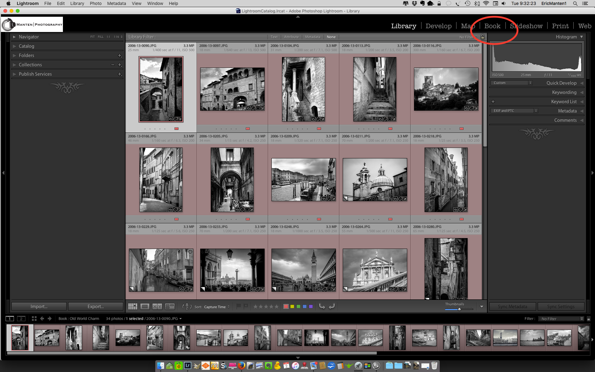
You then will be in the section of Lightroom where you can create books in several formats.
In this screen, go to the Book Settings drop-down area and select "Blurb". This is also the place where you can select book size, cover type, paper type, and if you want to have the Blurb logo printed on the last page of your book (select 'yes' if you want to get a discounted book price!).

This will change your options to create a book with Blurb. You will see a full menu to the right to create front and end pages and to select several layout types for each page. You can add text to pages, and create a professional looking photo book by dragging and dropping the images you want on the page layouts you create.
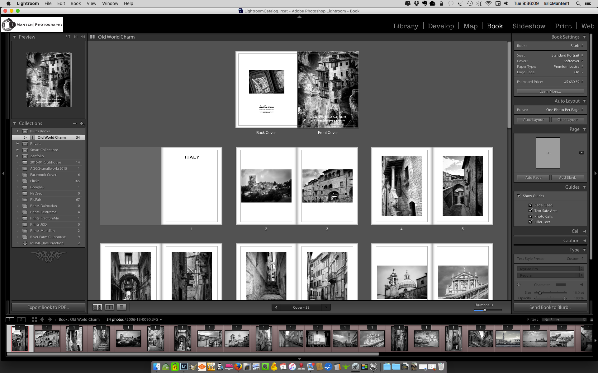
The final step is to go to the bottom right of your page and click 'Send Book to Blurb...'.

This finalizes the process in Lightroom and uploads your book to Blurb: you will be connected to the Blurb website to check book-type, paper quality, and - if you want to sell your book to the public - selling options. Please note that you need to create an account with Blurb if you don't have one yet.
The process is very straightforward and easy, and to see an example of how a final product looks just have a look at my Old World Charm book.
There is a Blurb page with specific instructions if you want to read more about the process of creating photo books with Lightroom and Blurb.

5 Great Reasons For Shooting Film (part 5)
How shooting film will improve your photography (part 5)
This is the fifth and last post in a series of five in which I share the for me five best reasons why I will continue to use my film cameras. Reasons, for which I recommend that you also should consider picking up one of…
How shooting film will improve your photography (part 5)
This is the fifth and last post in a series of five in which I share the for me five best reasons why I will continue to use my film cameras. Reasons, for which I recommend that you also should consider picking up one of those older cameras, a roll of film, and giving it a try; and why it actually will improve your photography [first, second, third and fourth posts in this series].
My fifth great reason for shooting film after the break.

You actually will have pictures in your hand
Although I love to share my pictures via Zenfolio [note: currently I use SquareSpace], I sometimes also want to have a tangible product. When shooting film it is just easier for me to get actual prints: I usually order them when I have the film developed and scanned. No need to go through the process of preparing the image in Lightroom for printing and taking or sending the digital file to a lab or printer, or printing it at home. And to be honest: as a result of these additional steps needed, most of my digital pictures only live in the digital world.
This was the last post in this series about five great reasons for shooting film. There is actually one bonus reason: it is just fun to fiddle with the mechanics of a film camera, going through all the actions to make sure all settings are correct. It is just more fun than working with the digital stuff, even if you are shooting your dSLR or mirror-less camera in 'full manual' mode.
Does that meant that I am against digital cameras and images? Absolutely not! I still am using my X-Pro1 more than my film cameras, and I love the versatility of digital. For me, these are two different worlds, and I am lucky I can live in and with both.
So go out there, check eBay for your first film camera, put a roll in it, and start shooting!
5 Great Reasons For Shooting Film (part 4)
How shooting film will improve your photography (part 4)
This is the fourth post in a series of five in which I share the for me five best reasons why I will continue to use my film cameras. Reasons, for which I recommend that you also should consider picking up one of those…
How shooting film will improve your photography (part 4)
This is the fourth post in a series of five in which I share the for me five best reasons why I will continue to use my film cameras. Reasons, for which I recommend that you also should consider picking up one of those older cameras, a roll of film, and giving it a try; and why it actually will improve your photography [first, second and third posts in this series].
My fourth great reason for shooting film after the break.

You spend less time in post-processing
First of all, since you only have a limited number of exposures per roll you probably will be more selective about taking a picture. As a result, you will have fewer pictures to go through per session, which of course will save time when reviewing and selecting your best images.
But even more important, it is my personal experience that a well-taken picture (i.e. correct shutter time, aperture and sharpness for the result you want to achieve) on film needs less post-processing than a well taken digital picture.
Here I have to admit that at this moment I am only shooting film, not developing. I send my rolls to a professional lab for developing, scanning and printing. I upload the scans into Lightroom for minimal post-processing and publishing on my portfolio pages.
The next and last post in this series I will talk about a more tangible reason for shooting film.